


Hello, everyone! I am working on trying to replicate a visualization generated in Excel/Powerpoint into Qualtrics Dashboards and would love some guidance. I know that we likely won’t be able to exactly replicate this, but I would appreciate another set of eyes on this.

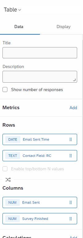
When trying to build this out, I am realizing that we will need to split up the widget into two because of the Respondent Funnel data (the 3-5 columns) and the normal data. I am just hoping we won’t have to split it into three.
This is what I have started with but I ran out of Rows/Columns already.
Thank you all so much in advance. This is a unique use case but I am hopeful we can come up with something that would be visually appealing.
Best answer by Deepak
View original
