
Hello experts,
One of our customer today gets 360 surveys run in one of .net based platform which they will be sunsetting soon, they are considering Qualtrics 360 surveys to meet their requirements however they have a very comprehensive detailed report summary that they release to their leadership employees as a part of their 360 evaluations.
Can you please advise if the comparative and trend tables as in the attached image can be built as part of 360 Reports and how we can achieve the same? It would be great if you could give some help or ideas how we can achieve this in the 360 reports technically? We need to do a POC and recommend to the customer that these kind of detailed and comparative data analysis in possible in Qualtrics 360 reports.
Please help.
Regards,
Manjista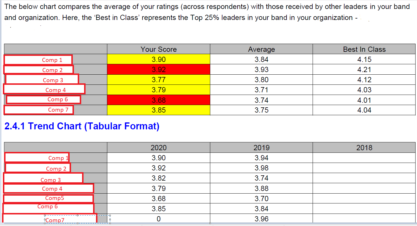

360 Comparative and Trend Reports
Best answer by AdamK12
I'm happy to, Manjista - I think there are several options here, some of which involve Qualtrics, some of which can involve other tools. In the end, the decision is really up to you as the product owner, and your audience in terms of how they would best like to receive the information.
If you would like to work in the reports tab, you can use a bar chart that would show the differences between individual, average, and best in class scores, each delineated by a separate color. (Depending on how you are collecting information, I would expect that you would need to import these data.) Also depending on the level of complexity that you would like to create, you may decide to either show all comps in the same chart, or have a separate chart for each comp. (I would lean towards the former because it is probably useful to compare scores across comps.)
You could do similar things in a Vocalize dashboard. The advantage would be that the chart would be interactive (in other words, your audience can filter their specific report based on their score).
If you are able to use a separate data visualization tool like Tableau or PowerBI, you can also merge your 360 data with other data in interesting ways.
I hope that helps! If you'd like to discuss more, please don't hesitate to reach out!
Best,
Adam

Sign up
Already have an account? Login

Welcome! To join the Qualtrics Experience Community, log in with your existing Qualtrics credentials below.
Confirm your username, share a bit about yourself, then you're ready to explore and connect .
Free trial account? No problem. Log in with your trial credentials to join.
No free trial account? No problem! Register here
Already a member? Hi and welcome back! We're glad you're here 🙂
You will see the Qualtrics login page briefly before being taken to the Experience Community.
Login with Qualtrics
Welcome! To join the Qualtrics Experience Community, log in with your existing Qualtrics credentials below.
Confirm your username, share a bit about yourself, then you're ready to explore and connect .
Free trial account? No problem. Log in with your trial credentials to join. No free trial account? No problem! Register here
Already a member? Hi and welcome back! We're glad you're here 🙂
You will see the Qualtrics login page briefly before being taken to the Experience Community.
Login to the Community
Welcome! To join the Qualtrics Experience Community, log in with your existing Qualtrics credentials below.
Confirm your username, share a bit about yourself, then you're ready to explore and connect .
Free trial account? No problem. Log in with your trial credentials to join.
No free trial account? No problem! Register here
Already a member? Hi and welcome back! We're glad you're here 🙂
You will see the Qualtrics login page briefly before being taken to the Experience Community.
Login with Qualtrics
Welcome! To join the Qualtrics Experience Community, log in with your existing Qualtrics credentials below.
Confirm your username, share a bit about yourself, then you're ready to explore and connect .
Free trial account? No problem. Log in with your trial credentials to join. No free trial account? No problem! Register here
Already a member? Hi and welcome back! We're glad you're here 🙂
You will see the Qualtrics login page briefly before being taken to the Experience Community.
Enter your E-mail address. We'll send you an e-mail with instructions to reset your password.