Hello,
Qubie here.
I've created a survey with a question that asks the user to rank order a list of features from 1 Must have to 7 Nice to Have. Ultimately I'd like to determine the order or most preferred features from 100 survey respondents. This has already been designed as a rank order (drag and drop) so I have 2 questions 1) How can I best determine the order of those features prioritized from 1-7 for reporting (visualization) and 2) is there a better way to approach this in the future?

Rank Order question

Userlevel 4
 +13
+13
I think the best would be the drag and drop only in rank question setup and you can also use randomization (flip 1-7/7-1) to get the the required output in the best possible way.

Hi,
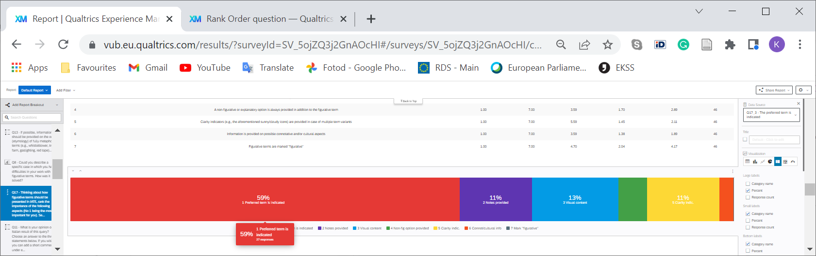
I have the same question, what is the best way to visualise the responses of the rank question? I just need to determine the final ranking of 7 items, all respondents combined. Bar chart and breakdown bar don't give an easy overview of what is No 1. The seventh item is missing from the breakdown bar. Do you have instructions on how to interpret and visualise the results of the rank question?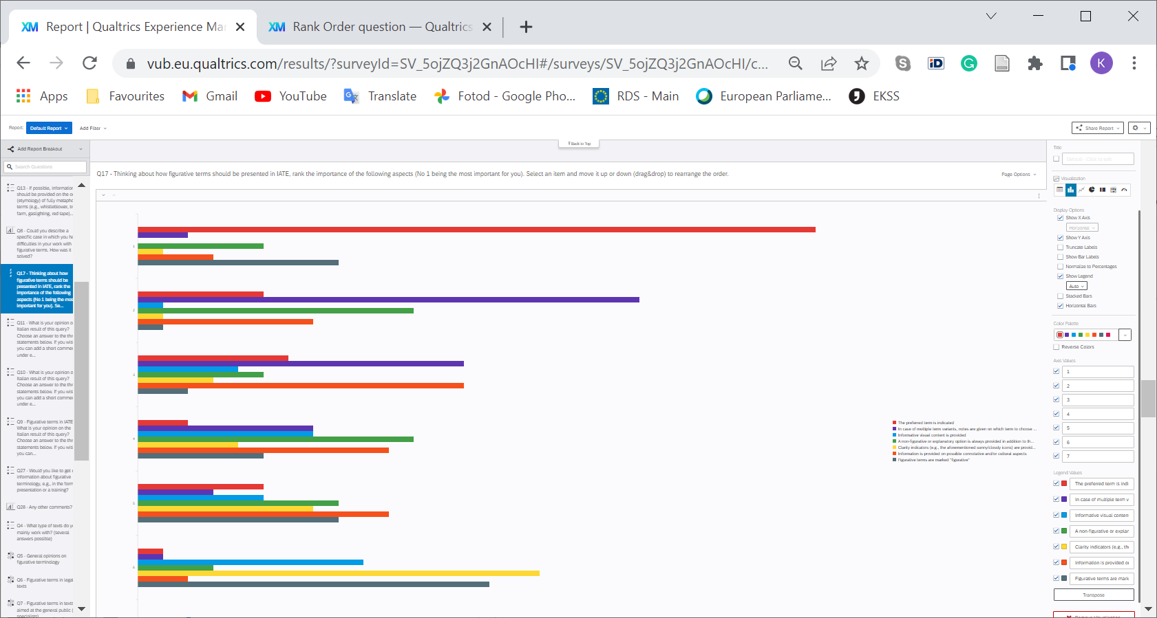
Userlevel 4
+13
kjarve I believe table should be better to give you a brief on the most and least items.
Ok crew. I am new to this Qualtrics community, and not off to a great start since the question I was searching for (same as yours,
- A bunch of bologna and non-helpful answers on the web. (ok, ok. I’m getting over it slowly). (Asterisk: nothing I could understand as a newbie qualtrics user. But also, legit, nothing looked fully answered.)
- I exported the response results, resigned to my fate to gather results manually and just eyeball what was the most popular. What I saw was a list of ratings from each responder for each possible answer that the user could rank. I figure you could probably use that if I could get an average of them (shout out/thanks to one of those community questions that got me thinking about that; although I didn’t understand their answer enough to make use of it).
- I found a handy-dandy tab in the Qualtrics Data & Analysis tab called “Crosstabs iQ”.
- I dragged my singular “ranking” question into the rows section of the Crosstab iQ chart section.
- I chose “average” in the “cells” section.
- Because “add filter” at the top doesn’t allow me to add the response type and filter out previews (why oh why oh why, Qualtrics?), I chose Response Type from the variables and dragged that over to the Columns section, and excluded previews.
- I exported the resulting chart with numbers to Excel and made a chart in Excel.
- Comparing the chart to the results from each responder, I think this is working as expected. FINALLY. The only trick is remembering that “1” (if you said so to your responders like I did) is actually a “high” score, and the higher scores are actually “low”.
Leave a Reply
Enter your username or e-mail address. We'll send you an e-mail with instructions to reset your password.