My survey rates workers on different criteria on a scale from 1 to 4. I want to group certain questions onto one bar chart. I've created a field group in the Dashboard data, but can't figure out how to make the appropriate widget. Creating a simple chart with a Count metric just displays how many people answered each question, but I want to see how many people (or what percent of people) were at a 1, 2, 3, or 4 for each question.

Solved
How do I group different questions onto one bar chart?
Best answer by Rich_Boits_Walker
Hi cryan01 ,
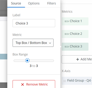
You're on the right track here. The simplest way I've found to make a good visualization for this is to use the field group and horizontal bar - simple chart.
- Set the X-Axis to your field group
- Then setup up your metric using the Top Box / Bottom Box metric type and move the option bar to just include a single choice. You will want to label it appropriately as it will display in the key.
- Add a separate metric for each of the remaining choice values.
- Then select Stack Chart from graph options at the bottom
This will give you a stacked bar for each questions broken by choice value.


Enter your E-mail address. We'll send you an e-mail with instructions to reset your password.