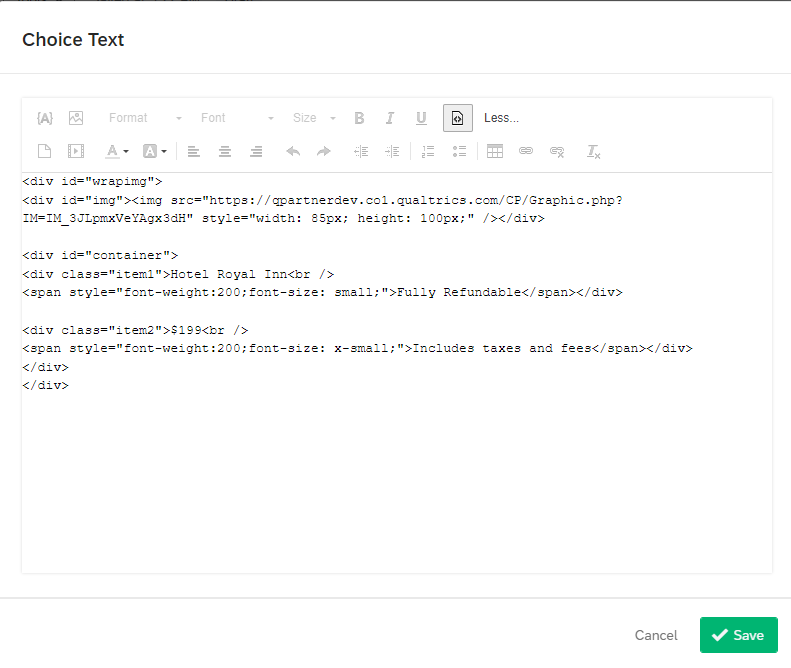
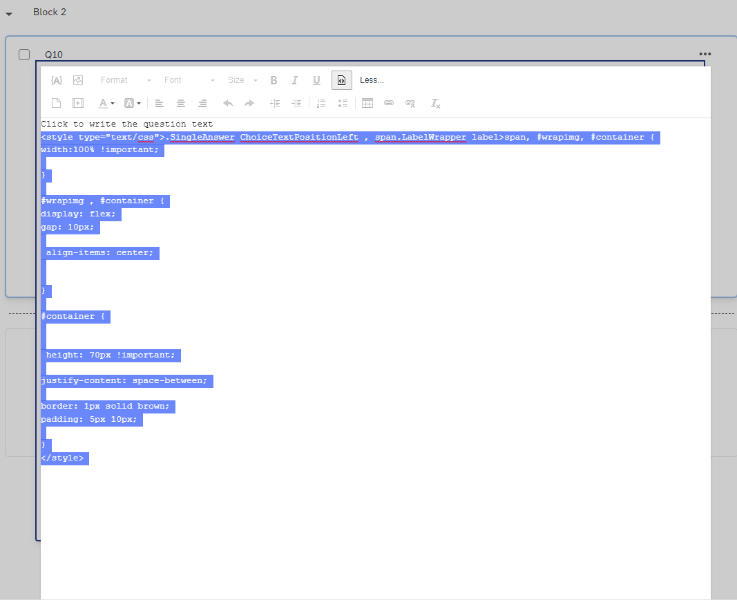
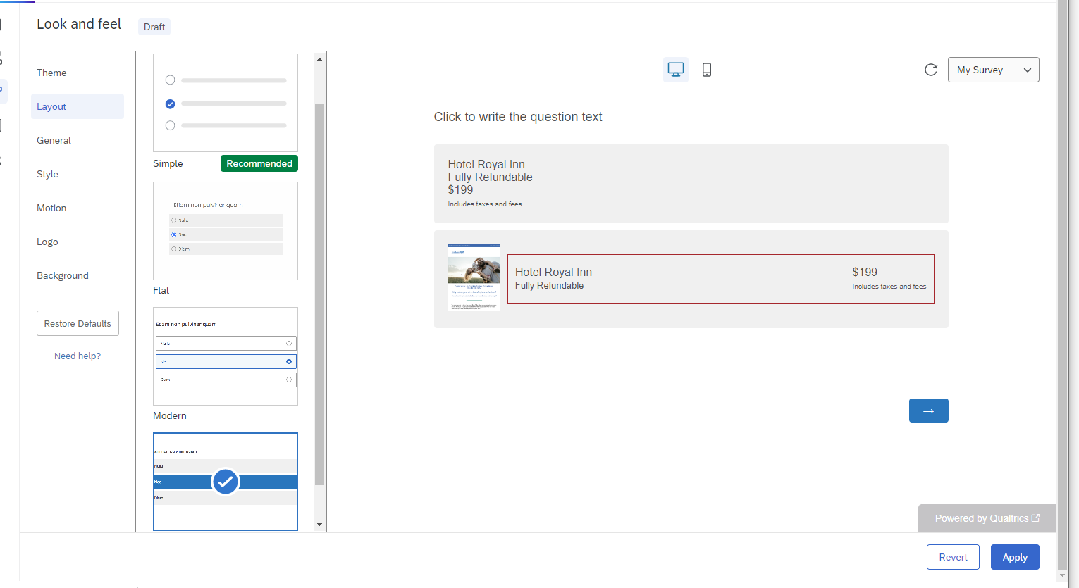
I want the choices to a particular question to appear like the hotel listings on an aggregator (Ex: Expedia).
Specifically, I am looking for an option where I can have text (like Hotel name) left aligned and other text (like price) right aligned on the same line. The following image is an example of what I want the choices to look like.  1, How do I get both left aligned and right aligned text on the same line in a choice? (I tried inserting a table with 2 columns - which kind of works, but then the mobile view of the choice requires scrolling to the right).
2. How do I get rid of the choice bubble - I just want the choice to be clickable, without the choice radio button.
3. Is there an easy way to outline the choice (as in this example with a small brown margin)?
4. Can I add a small image on the left of each choice, as above, with the size automatically adjusted to match the height of the choice option?
Thanks!!

Choice Layout: Left aligned and Right Aligned text on same line
 +1
+1
 hope this resolves your query😊!!!
Sign up
Already have an account? Login

Welcome! To join the Qualtrics Experience Community, log in with your existing Qualtrics credentials below.
Confirm your username, share a bit about yourself, then you're ready to explore and connect .
Free trial account? No problem. Log in with your trial credentials to join.
No free trial account? No problem! Register here
Already a member? Hi and welcome back! We're glad you're here 🙂
You will see the Qualtrics login page briefly before being taken to the Experience Community.
Login with Qualtrics
Welcome! To join the Qualtrics Experience Community, log in with your existing Qualtrics credentials below.
Confirm your username, share a bit about yourself, then you're ready to explore and connect .
Free trial account? No problem. Log in with your trial credentials to join. No free trial account? No problem! Register here
Already a member? Hi and welcome back! We're glad you're here 🙂
You will see the Qualtrics login page briefly before being taken to the Experience Community.
Login to the Community
No account yet? Create an account
Welcome! To join the Qualtrics Experience Community, log in with your existing Qualtrics credentials below.
Confirm your username, share a bit about yourself, then you're ready to explore and connect .
Free trial account? No problem. Log in with your trial credentials to join.
No free trial account? No problem! Register here
Already a member? Hi and welcome back! We're glad you're here 🙂
You will see the Qualtrics login page briefly before being taken to the Experience Community.
Login with Qualtrics
Welcome! To join the Qualtrics Experience Community, log in with your existing Qualtrics credentials below.
Confirm your username, share a bit about yourself, then you're ready to explore and connect .
Free trial account? No problem. Log in with your trial credentials to join. No free trial account? No problem! Register here
Already a member? Hi and welcome back! We're glad you're here 🙂
You will see the Qualtrics login page briefly before being taken to the Experience Community.
Enter your E-mail address. We'll send you an e-mail with instructions to reset your password.