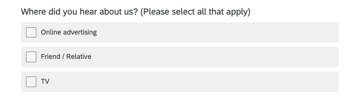


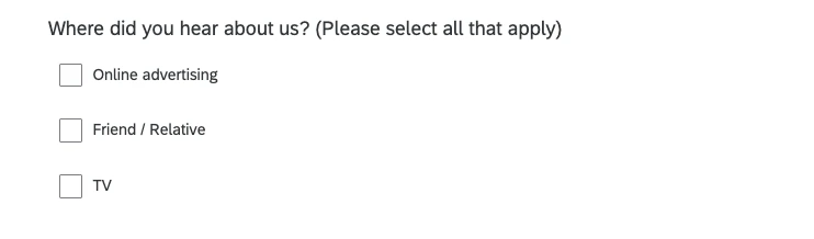
Wanted to share a quick CSS snippet I put together to make the New Survey Taking Experience feel more like the Classic theme. Right now, it’s easy for users to think they have to click directly on the little square to select an option, which makes the click target feel tiny for short text. This works for both single and multiple choice!
/* Changes the background and text color of the answer choices */
.mc .choice-label {
background: rgba(0, 0, 0, .06);
color: var(--palettes-text-1, #32363a);
}

/* Extends the answer choices */
.mc .choices {
width: 100%;
}
All custom code is used at your own risk.
Before:
After: