Hi Qualtrics community
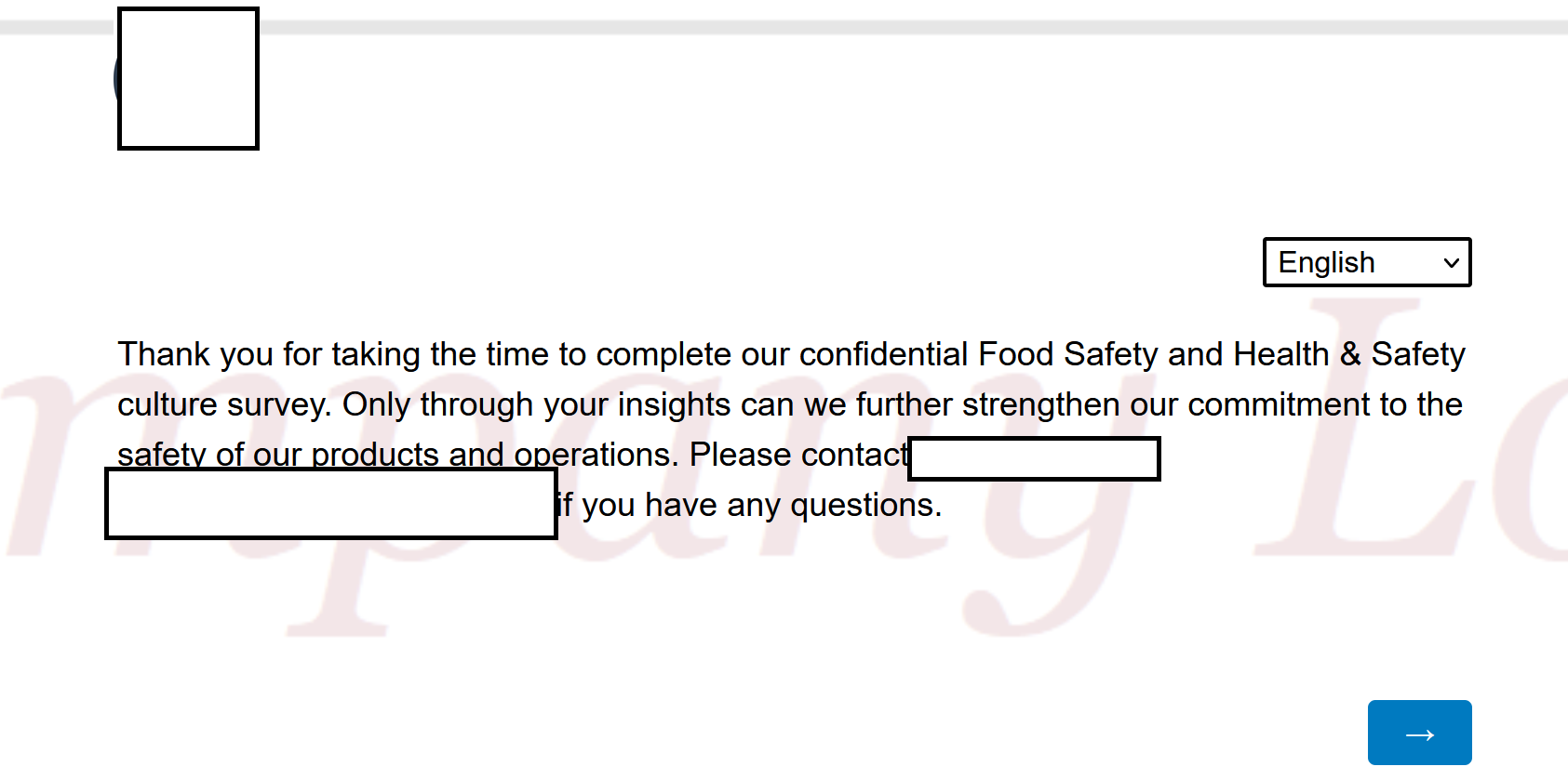
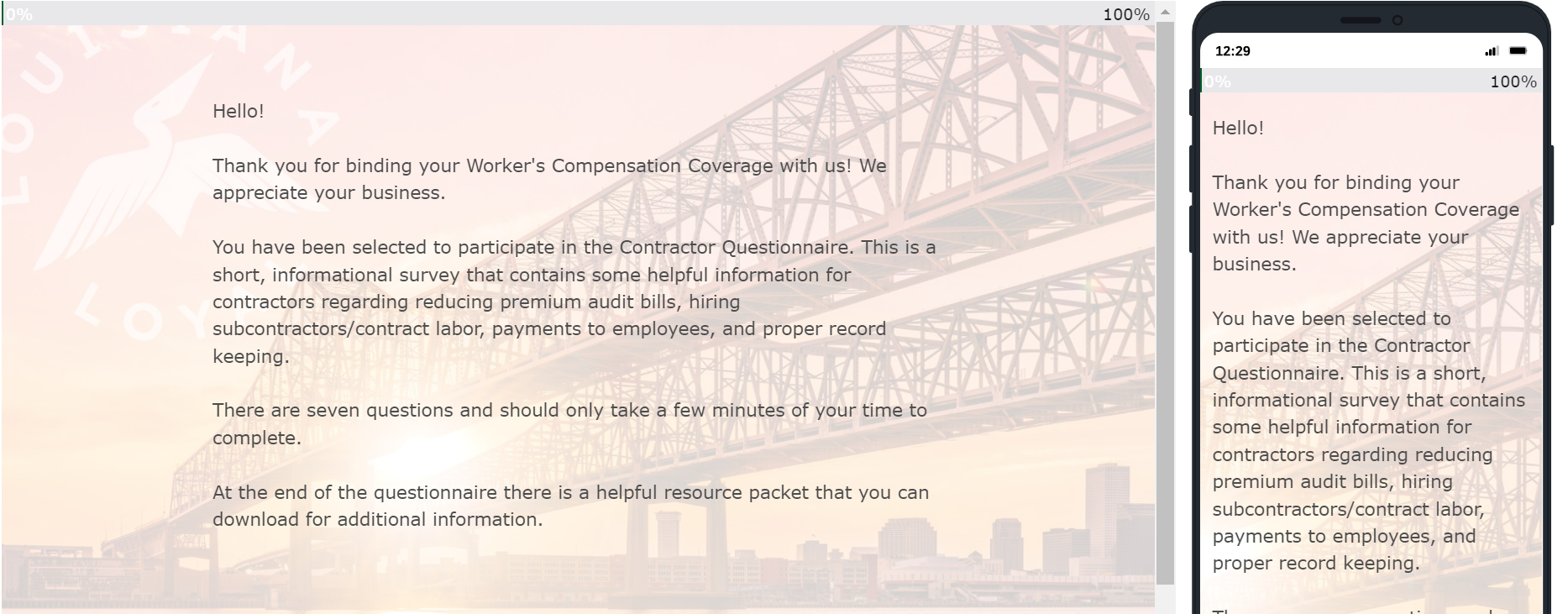
I'm struggling to resize the background for my Qualtrics survey. This is what I have:
[for desktop]: [for mobile]:
 I want to have the full Company Logo as watermark in the back, but it showed up extremely fuzzy and cropped in both desktop and mobile.
My CSS script is here: I have no experience with CSS script before, how can I resize Company Logo to fit the screen for both desktop and mobile users?
Many thanks!
How to resize background for desktop and mobile?
 +1
+1Best answer by ColbyA
Hey sophietwu ,
One of the key parts for a background image is using a large size, high resolution and quality image. To start, just consider proportion of a small/medium image to be stretched for desktop use and it likely won't be clear.
Consider asking your design team for a new logo image that would also look clear and be appropriate for use as a desktop background.
What I've found to work the best is asking my MarComm team to design a desktop quality image to use as a survey background. It won't always align perfectly with mobile but centering the logo or most important part can help.
An example. This is a repurposed desktop image our staff uses as a video call background which also fits well with the theme for a survey we send for construction clients.
Sign up
Already have an account? Login

Welcome! To join the Qualtrics Experience Community, log in with your existing Qualtrics credentials below.
Confirm your username, share a bit about yourself, then you're ready to explore and connect .
Free trial account? No problem. Log in with your trial credentials to join.
No free trial account? No problem! Register here
Already a member? Hi and welcome back! We're glad you're here 🙂
You will see the Qualtrics login page briefly before being taken to the Experience Community.
Login with Qualtrics

Welcome! To join the Qualtrics Experience Community, log in with your existing Qualtrics credentials below.
Confirm your username, share a bit about yourself, then you're ready to explore and connect .
Free trial account? No problem. Log in with your trial credentials to join. No free trial account? No problem! Register here
Already a member? Hi and welcome back! We're glad you're here 🙂
You will see the Qualtrics login page briefly before being taken to the Experience Community.
Login to the Community

Welcome! To join the Qualtrics Experience Community, log in with your existing Qualtrics credentials below.
Confirm your username, share a bit about yourself, then you're ready to explore and connect .
Free trial account? No problem. Log in with your trial credentials to join.
No free trial account? No problem! Register here
Already a member? Hi and welcome back! We're glad you're here 🙂
You will see the Qualtrics login page briefly before being taken to the Experience Community.
Login with Qualtrics

Welcome! To join the Qualtrics Experience Community, log in with your existing Qualtrics credentials below.
Confirm your username, share a bit about yourself, then you're ready to explore and connect .
Free trial account? No problem. Log in with your trial credentials to join. No free trial account? No problem! Register here
Already a member? Hi and welcome back! We're glad you're here 🙂
You will see the Qualtrics login page briefly before being taken to the Experience Community.
Enter your E-mail address. We'll send you an e-mail with instructions to reset your password.


