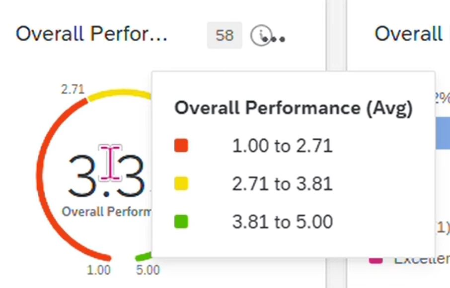
In a gauge chart, i want to set colour showing 1 to 2.7 as red, 2.8 to 3.7 as yellow,3.8 to 5 as green.
The challenge is in display it lets you give min, max and < values. And that value is used to set the upper limit of red and lower limit of yellow, etc.
Can we do anything so that we get the values as desired ?
Best answer by vgayraud
Hi @Neha Tank
It’s not possible to achieve what you want with the existing widget. I’ve had similar requests from clients, they settled either for adding a note in the widget’s description or adding a text widget by the gauge to clarify.
Other than that, you’d have to create your own plugin or reach out to Qualtrics engineering services.
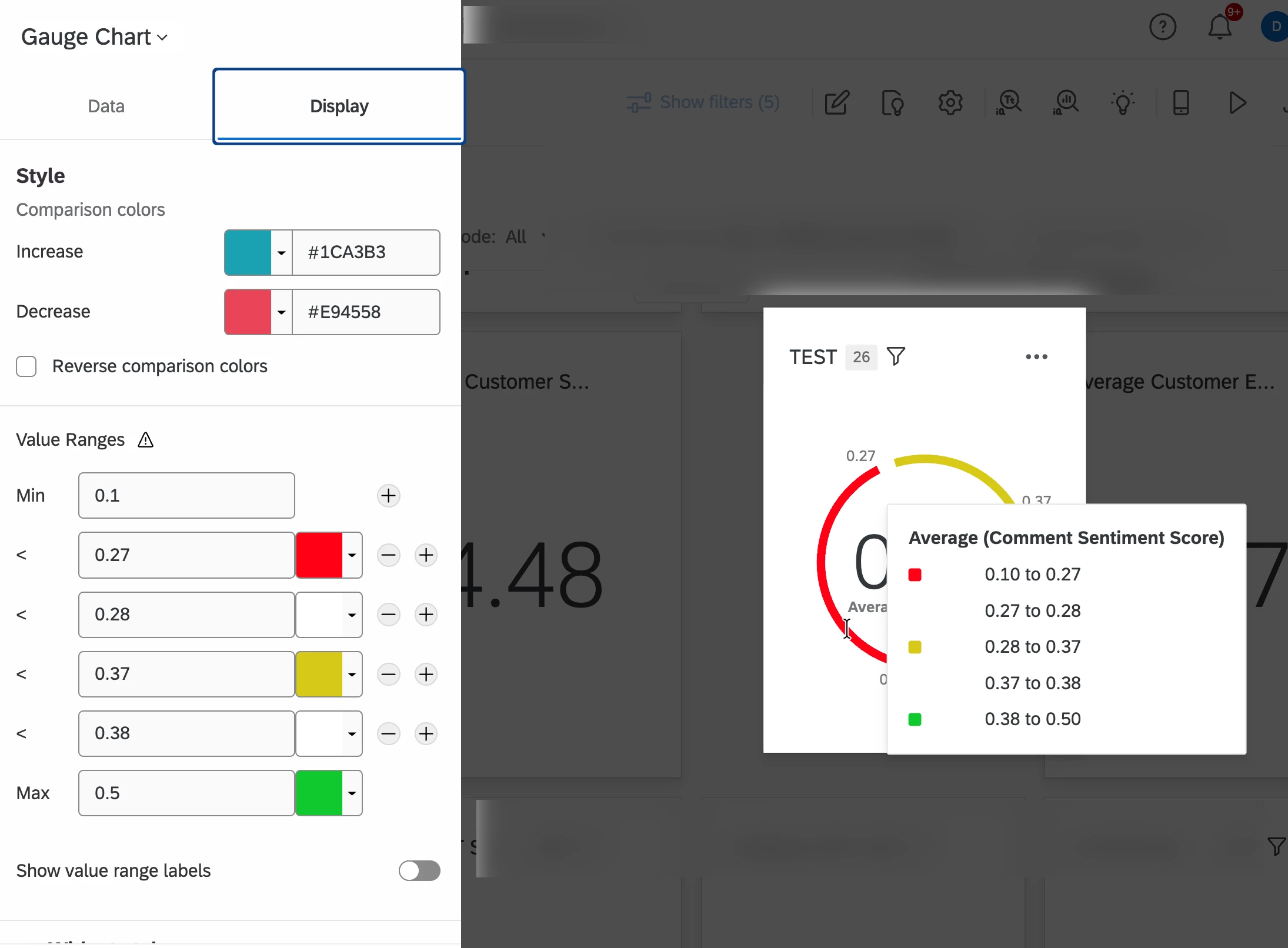
@Neha Tank This may not be as clean but you could add values between and use white as the color for those (between 2.7 and 2.8). See attached example. I didn’t have data to match so my decimal points are in a different spot than your example you provided.
@UXDana , thanks for the suggestion. The only problem is in tool tip it would show the ones in between too (the white ones) and that might confuse the users.
It’s not possible to achieve what you want with the existing widget. I’ve had similar requests from clients, they settled either for adding a note in the widget’s description or adding a text widget by the gauge to clarify.
Other than that, you’d have to create your own plugin or reach out to Qualtrics engineering services.