Can't make form field text entry sizes smaller. | XM Community
Skip to main content

Hi everyone,  using the form field question format, I am providing information and then asking respondents two short questions. The responses should be percentages (e.g., 75%), so the boxes should be very small.


I have edited the validation and chosen short (and also required numeric responses).


However, no matter what I try I can’t seem to get the text boxes to be appropriately sized for percentages. I have tried editing the javascript at the question level with:


jQuery("#"+this.questionId+" .InputText").css("width", "15px");


I have also tried doing the same for the CSS under ‘look and feel.’


However, my survey still looks like this:
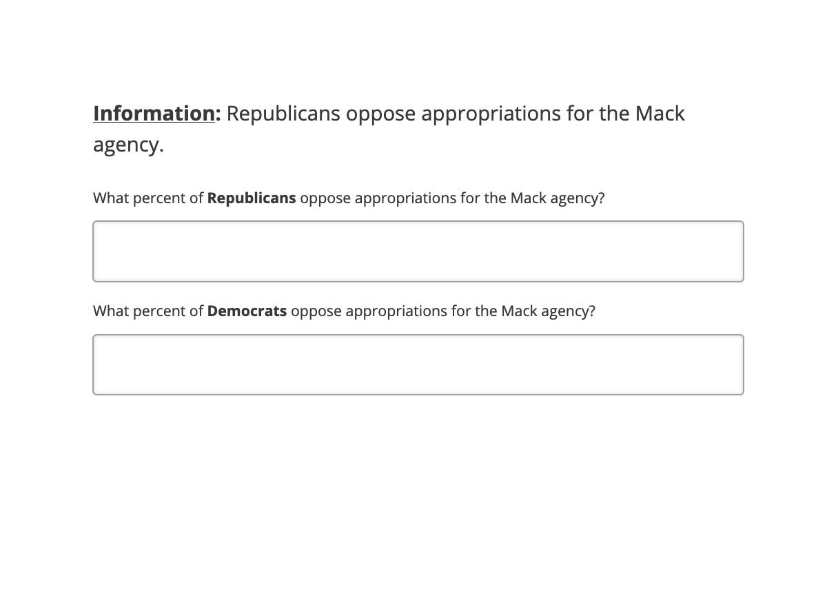
 

I would like for the entry boxes to be about 90% smaller. Any suggestions? Thanks.

Hi @gusnovoa,

Nice to e-meet you.


This is known discrepancy with the setup, having said that you can easily over come this by following below steps:
 

  1. Navigate to your question and drag the text box horizontally and make a note of dimensions shown while you drag
     
  2. Once the desired size is achieved, drag other boxes till you achieve exact same dimensions.
     

Let me know if this helps.


Hello Saurabh,


Unfortunately, I have already tried that. I have the dimensions of each box to the minimum width, which is apparently 29px. However, when I preview the survey, the text entries in the question are still very large (as in the screenshot above). Is there anything else that I can try?


Hi @gusnovoa,

I can see you are using the “Modern” theme, could you please try changing the theme to “Blank”? 

Best,
Saurabh


I was actually using the flat theme but switching to blank did the trick. Thank you so much Saurabh.


Hi @gusnovoa,

Glad to know that I am able to help :)


Apologies if this should be in a new thread.


I switched the theme and now my questions look like this:


The text entry boxes are smaller as desired, but now the questions themselves are very condensed. How can I increase the width allotted to them so that they are not spread out over so many lines?


Leave a Reply