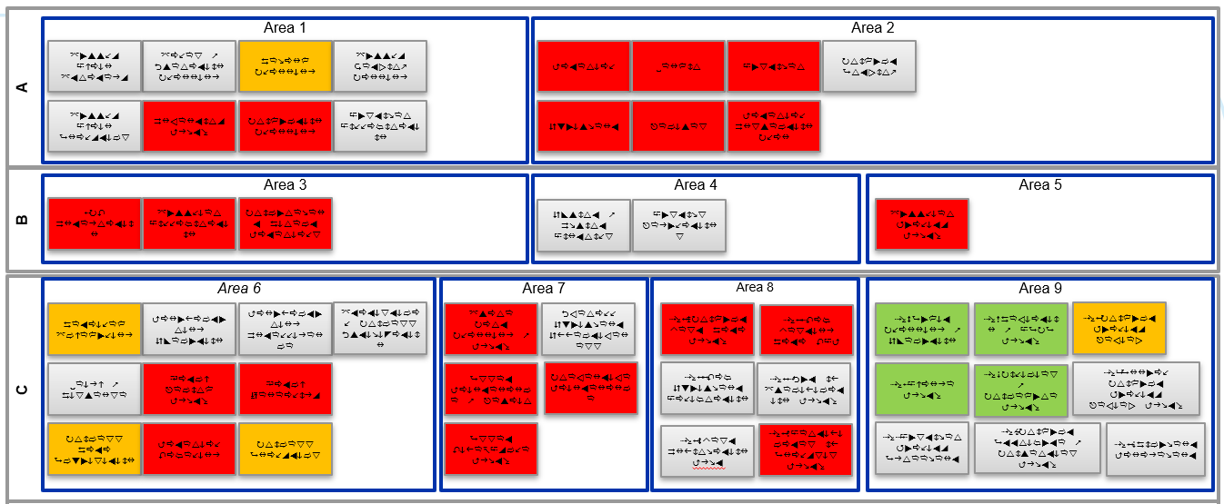
Hi, I need to create a custom report or dashboard that indicates data ranges for embedded data values. e.g. value <25, color shape as RED, value greater than 75, color shape GREEN, etc. The resulting report would look similar to the image shown below/attached. Is this possible within Qualtrics?
Thanks in advance for any suggestions.