Adjust Layout and Padding on Pick, Group, and Rank Question | XM Community
Skip to main content

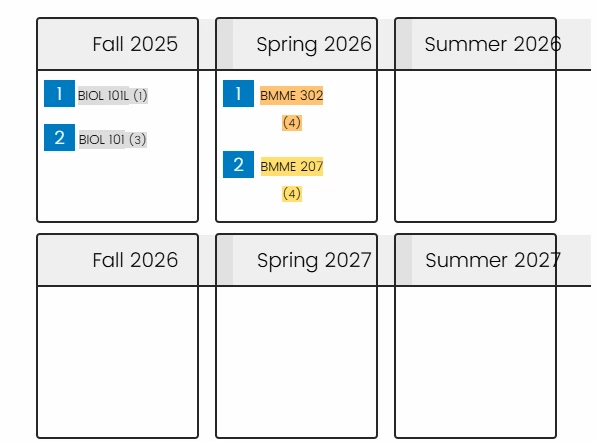
I am hoping to adjust a few things about my Pick, Group, and Rank question (screenshot below). I would like to make the following changes: 

  1. Three columns instead of two
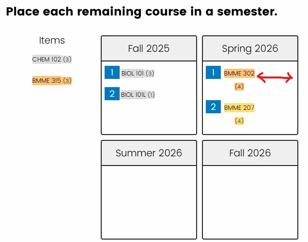
  2. Reduce the amount of padding in each group box (i.e. reduce the distance indicated by the red arrow below). The items that I drag into each box are wrapping onto 2 lines when there is still LOTS of space to the right of the text in the box.

Ideally, I could implement these changes in the “New Survey Taking Experience” using CSS. I already found some code on another post that helped convert to 3 columns (included below) but it does NOT work when I switch over to the New Survey Taking Experience. If what I am asking is only possible in the old survey mode, I can live with that.

My theme is set to Blank, if that helps.

I am a complete novice with code, and I appreciate any help on this!


Code that only works in OLD survey mode:!--startfragment>

.Skin .PGR .DragAndDrop .Group h2 { width: 100% !important;}

.Skin .PGR .DragAndDrop .Group { width: 33% !important;}

.Skin .PGR .DragAndDrop .Group>div>ul, .Skin .PGR .DragAndDrop .Items>ul { min-height: 250px !important; } }

!--endfragment>

Hi ​@theresa890
Custom CSS alone often won’t work reliably in NSTE due to container constraints. Instead:
1.    Go to the Look & Feel editor.
2.    Under Advanced → “Custom CSS,” you can try injecting the following (though it may not always work in NSTE):
.PGR .DragAndDrop .Group {
  width: 30% !important;  /* Slightly less than 33% to fit 3 in a row */
  margin-right: 1% !important;
  display: inline-block !important;
  vertical-align: top !important;
}
3. Make sure you’re using a “Blank” theme or one that doesn’t override layouts heavily.

Let me know if it helps.
-- Rochak


@rochak_khandelwal Thanks for your response! Here is how my question looks now. There are now three columns, but the titles seem to need adjusting, and the text wrapping is still an issue. 

I tried the code on NSTE, and nothing about the format changed. The screenshot below is from when I revert back to the old STE.


hi ​@theresa890, try this CSS in old STE:
.PGR .DragAndDrop .Group ul li {
  padding-right: 4px !important;
  white-space: nowrap !important;
}

Let me know if you still face any issues.
-- Rochak


@rochak_khandelwal that fixed the text wrapping issue - thank you! The titles were still wonky, so I combined your code with some of the code I found on another post. Here is what worked in the end: 

.PGR .DragAndDrop .Group {
  width: 30% !important;  /* Slightly less than 33% to fit 3 in a row */
  margin-right: 1% !important;
  display: inline-block !important;
  vertical-align: top !important;
}
.PGR .DragAndDrop .Group ul li {
  padding-right: 4px !important;
  white-space: nowrap !important;
}

.Skin .PGR .DragAndDrop .Group h2 { width: 100% !important;}

.Skin .PGR .DragAndDrop .Group>div>ul, .Skin .PGR .DragAndDrop .Items>ul { min-height: 250px !important; } 


Awesome to hear, ​@theresa890! Glad the combination worked and fixed the wrapping issue.
Your final CSS looks great — that inline-block tweak and title adjustment really brought it together neatly.


Leave a Reply