Hi there!
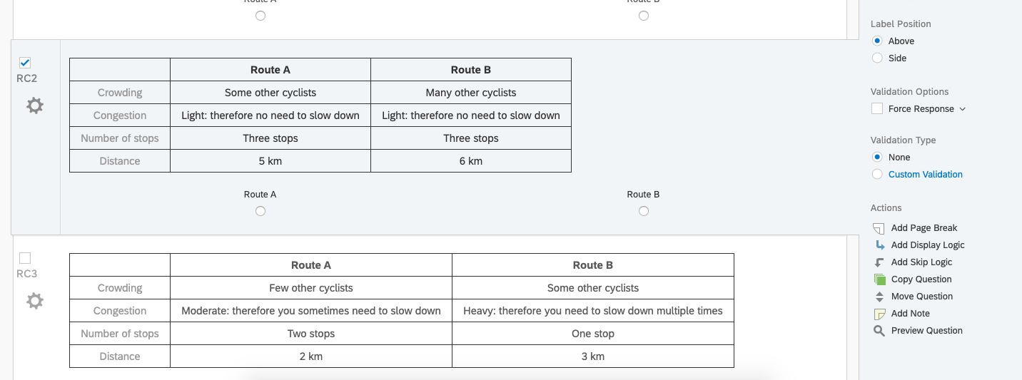
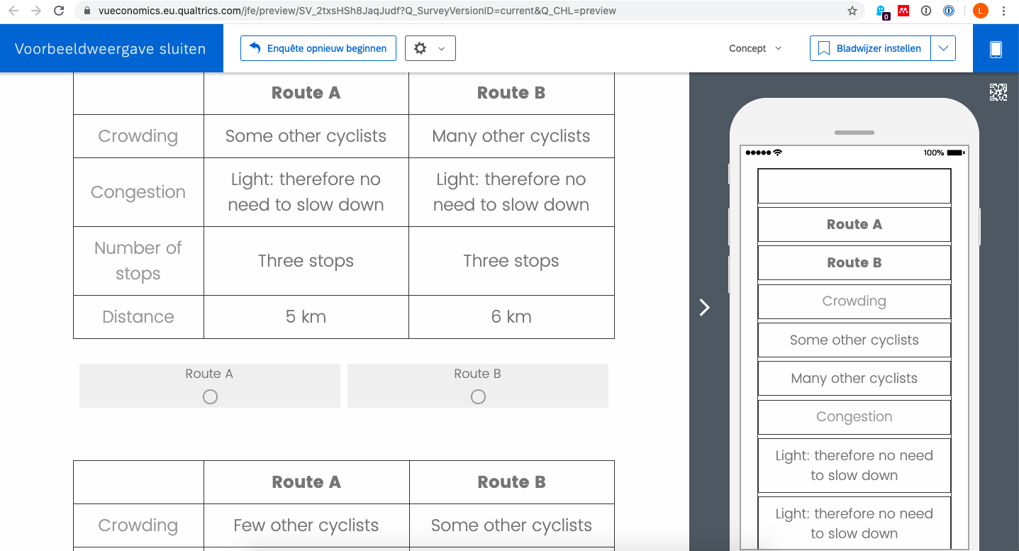
I am currently making a stated preference survey in Qualtrics. I am using regular multiple choice questions and changing the question text to a simple table form (see picture attached). The problem however with this is that once I preview my survey and check the mobile version of it all cells of the table are presented below each other (see other picture) instead of having the full size table.
I know people are having the same issues when they use a 'matrix' type question and there is a simple way of clicking the 'mobile friendly' option on the right side.. but unfortunately nothing like this exists for the multiple choice question.
Therefore my question is: is there a way to change the preview of this table in the mobile version? Or otherwise: is there a way I can switch off this particular mobile version so people simply get the normal web version on their screen when accessing it on their phone. 

How do i change the appearance of a simple table in the mobile version?
Best answer by TomG
Adding the following to your question text will prevent each cell of the table from breaking in mobile view. You'll still have a number of other issues to deal with to make it respondent friendly.
Sign up
Already have an account? Login

Welcome! To join the Qualtrics Experience Community, log in with your existing Qualtrics credentials below.
Confirm your username, share a bit about yourself, then you're ready to explore and connect .
Free trial account? No problem. Log in with your trial credentials to join.
No free trial account? No problem! Register here
Already a member? Hi and welcome back! We're glad you're here 🙂
You will see the Qualtrics login page briefly before being taken to the Experience Community.
Login with Qualtrics

Welcome! To join the Qualtrics Experience Community, log in with your existing Qualtrics credentials below.
Confirm your username, share a bit about yourself, then you're ready to explore and connect .
Free trial account? No problem. Log in with your trial credentials to join. No free trial account? No problem! Register here
Already a member? Hi and welcome back! We're glad you're here 🙂
You will see the Qualtrics login page briefly before being taken to the Experience Community.
Login to the Community

Welcome! To join the Qualtrics Experience Community, log in with your existing Qualtrics credentials below.
Confirm your username, share a bit about yourself, then you're ready to explore and connect .
Free trial account? No problem. Log in with your trial credentials to join.
No free trial account? No problem! Register here
Already a member? Hi and welcome back! We're glad you're here 🙂
You will see the Qualtrics login page briefly before being taken to the Experience Community.
Login with Qualtrics

Welcome! To join the Qualtrics Experience Community, log in with your existing Qualtrics credentials below.
Confirm your username, share a bit about yourself, then you're ready to explore and connect .
Free trial account? No problem. Log in with your trial credentials to join. No free trial account? No problem! Register here
Already a member? Hi and welcome back! We're glad you're here 🙂
You will see the Qualtrics login page briefly before being taken to the Experience Community.
Enter your E-mail address. We'll send you an e-mail with instructions to reset your password.


