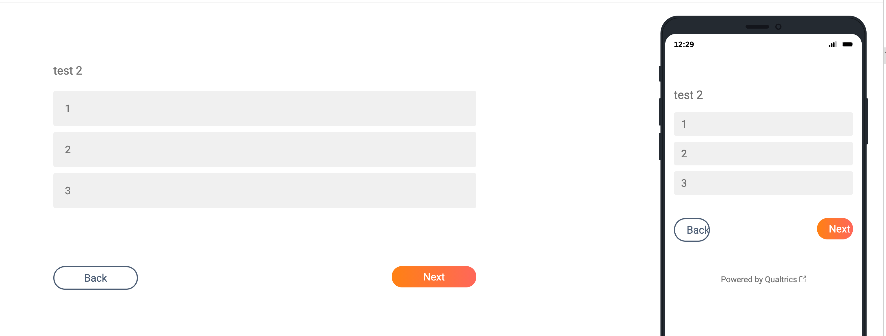
Hi,
I have the back and next button in my survey. In the desktop version of the survey, the text looks centered, but in the mobile version, it is not centered and it looks cutoff.  Does anyone know how to fix the style so that the text in centered also in mobile?
How to center the text inside next/back button
Best answer by Tom_1842
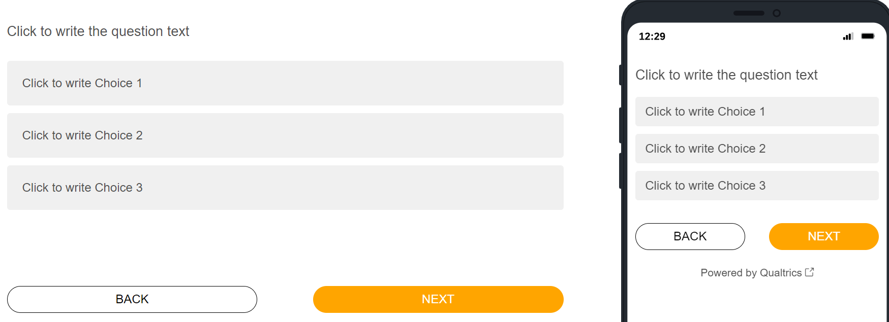
Hi there, if you still need, do you have CSS in place already? I wasn't able to reproduce where the text is right aligned on mobile, but you can change the button styling by using/modifying the below CSS. Try adding the below CSS to the Style section of the survey's Look & Feel:
.Skin #Buttons #NextButton, .Skin #Buttons #PreviousButton {
text-align: center !important;
padding: 0px !important;
width: 45% !important;
height: 35px !important;
border-radius: 30px !important;
}
.Skin #Buttons #NextButton {
background-color: orange !important;
}
.Skin #Buttons #PreviousButton {
background-color: white !important;
color: black !important;
border: 1px solid black !important;
}
Sign up
Already have an account? Login

Welcome! To join the Qualtrics Experience Community, log in with your existing Qualtrics credentials below.
Confirm your username, share a bit about yourself, then you're ready to explore and connect .
Free trial account? No problem. Log in with your trial credentials to join.
No free trial account? No problem! Register here
Already a member? Hi and welcome back! We're glad you're here 🙂
You will see the Qualtrics login page briefly before being taken to the Experience Community.
Login with Qualtrics

Welcome! To join the Qualtrics Experience Community, log in with your existing Qualtrics credentials below.
Confirm your username, share a bit about yourself, then you're ready to explore and connect .
Free trial account? No problem. Log in with your trial credentials to join. No free trial account? No problem! Register here
Already a member? Hi and welcome back! We're glad you're here 🙂
You will see the Qualtrics login page briefly before being taken to the Experience Community.
Login to the Community

Welcome! To join the Qualtrics Experience Community, log in with your existing Qualtrics credentials below.
Confirm your username, share a bit about yourself, then you're ready to explore and connect .
Free trial account? No problem. Log in with your trial credentials to join.
No free trial account? No problem! Register here
Already a member? Hi and welcome back! We're glad you're here 🙂
You will see the Qualtrics login page briefly before being taken to the Experience Community.
Login with Qualtrics

Welcome! To join the Qualtrics Experience Community, log in with your existing Qualtrics credentials below.
Confirm your username, share a bit about yourself, then you're ready to explore and connect .
Free trial account? No problem. Log in with your trial credentials to join. No free trial account? No problem! Register here
Already a member? Hi and welcome back! We're glad you're here 🙂
You will see the Qualtrics login page briefly before being taken to the Experience Community.
Enter your E-mail address. We'll send you an e-mail with instructions to reset your password.


