Hello,
I am wondering if there is a way of reconfiguring the Likert Matrix question, such that each row statement appears on the right side of the page rather than the left.
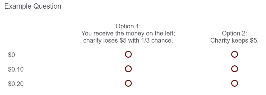
To give some more specifics: currently I have a question that looks something like this: For reasons I won't go into here, ideally I would like the positions of "Option 1" and "Option 2" flipped, such that the left option reads "Charity keeps $5" and the right option reads "You receive the money on the right, charity loses $5 with 1/3 chance." However, I do not know how to make the values of money ($0, $0.10, $0.20, etc.) appear on the right, rather than the left.
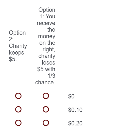
I tried using a Bipolar Matrix, but Qualtrics squeezed the headings into a very narrow space, such that it made the headings very difficult to read: If anyone has any tips, I'd be very grateful. This isn't something that is absolutely essential, but would improve the survey experience for the respondent.
Thanks,
David
Likert Matrix - Statements on the Right
Best answer by moowil
I don't think there's a "real" way to do this (via the admin UI) but this CSS might work for you. I haven't tested it in the real world so grain of salt, etc. Would almost certainly need media queries involved so that the mobile views aren't broken.
Still, hopefully it'll get you started. You can see it in action here: https://codepen.io/willthemoor/full/JjGQjXE
table.ChoiceStructure {
max-width: 95%;
}
table.ChoiceStructure,
table.ChoiceStructure thead,
table.ChoiceStructure tbody {
display: block;
width: 500px;
overflow: hidden;
}
table.ChoiceStructure tr {
display: block;
float: right;
width: 100%;
}
table.ChoiceStructure th, table.ChoiceStructure td {
display: block;
float: right;
width: 25%;
}
table.ChoiceStructure tbody th {
text-align: left;
font-weight: 300;
}
Sign up
Already have an account? Login

Welcome! To join the Qualtrics Experience Community, log in with your existing Qualtrics credentials below.
Confirm your username, share a bit about yourself, then you're ready to explore and connect .
Free trial account? No problem. Log in with your trial credentials to join.
No free trial account? No problem! Register here
Already a member? Hi and welcome back! We're glad you're here 🙂
You will see the Qualtrics login page briefly before being taken to the Experience Community.
Login with Qualtrics

Welcome! To join the Qualtrics Experience Community, log in with your existing Qualtrics credentials below.
Confirm your username, share a bit about yourself, then you're ready to explore and connect .
Free trial account? No problem. Log in with your trial credentials to join. No free trial account? No problem! Register here
Already a member? Hi and welcome back! We're glad you're here 🙂
You will see the Qualtrics login page briefly before being taken to the Experience Community.
Login to the Community

Welcome! To join the Qualtrics Experience Community, log in with your existing Qualtrics credentials below.
Confirm your username, share a bit about yourself, then you're ready to explore and connect .
Free trial account? No problem. Log in with your trial credentials to join.
No free trial account? No problem! Register here
Already a member? Hi and welcome back! We're glad you're here 🙂
You will see the Qualtrics login page briefly before being taken to the Experience Community.
Login with Qualtrics

Welcome! To join the Qualtrics Experience Community, log in with your existing Qualtrics credentials below.
Confirm your username, share a bit about yourself, then you're ready to explore and connect .
Free trial account? No problem. Log in with your trial credentials to join. No free trial account? No problem! Register here
Already a member? Hi and welcome back! We're glad you're here 🙂
You will see the Qualtrics login page briefly before being taken to the Experience Community.
Enter your E-mail address. We'll send you an e-mail with instructions to reset your password.

