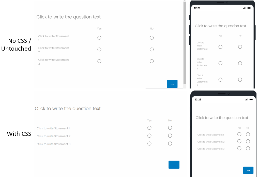
I have a matrix table with 6 short sub items and two response options (yes/no). This table is using all of the 700+ pixel width of the template, which means I have lots of white space between the columns in the table. If I adjust the width of the first column (by dragging the divider line) to as wide as makes sense given the content in the first column, there is still a ton of space between my yes and no columns because they are so wide. How can I get the yes/no response option columns closer together?
I think this will involve reducing the width of the underlying table. The following code, which I found in my search, reduces the width of the table to 500 px, but the now narrower table is centered and I need it positioned on the left similar to how other questions appear in my survey.
jQuery( '.ChoiceStructure' ).each(function () {
this.style.setProperty( 'max-width', '500px', 'important');
});
Is there a way to position it on the left by adding to the code above? Or is there a different solution I should be using?
narrow matrix table
Sign up
Already have an account? Login

Welcome! To join the Qualtrics Experience Community, log in with your existing Qualtrics credentials below.
Confirm your username, share a bit about yourself, then you're ready to explore and connect .
Free trial account? No problem. Log in with your trial credentials to join.
No free trial account? No problem! Register here
Already a member? Hi and welcome back! We're glad you're here 🙂
You will see the Qualtrics login page briefly before being taken to the Experience Community.
Login with Qualtrics

Welcome! To join the Qualtrics Experience Community, log in with your existing Qualtrics credentials below.
Confirm your username, share a bit about yourself, then you're ready to explore and connect .
Free trial account? No problem. Log in with your trial credentials to join. No free trial account? No problem! Register here
Already a member? Hi and welcome back! We're glad you're here 🙂
You will see the Qualtrics login page briefly before being taken to the Experience Community.
Login to the Community

Welcome! To join the Qualtrics Experience Community, log in with your existing Qualtrics credentials below.
Confirm your username, share a bit about yourself, then you're ready to explore and connect .
Free trial account? No problem. Log in with your trial credentials to join.
No free trial account? No problem! Register here
Already a member? Hi and welcome back! We're glad you're here 🙂
You will see the Qualtrics login page briefly before being taken to the Experience Community.
Login with Qualtrics

Welcome! To join the Qualtrics Experience Community, log in with your existing Qualtrics credentials below.
Confirm your username, share a bit about yourself, then you're ready to explore and connect .
Free trial account? No problem. Log in with your trial credentials to join. No free trial account? No problem! Register here
Already a member? Hi and welcome back! We're glad you're here 🙂
You will see the Qualtrics login page briefly before being taken to the Experience Community.
Enter your E-mail address. We'll send you an e-mail with instructions to reset your password.


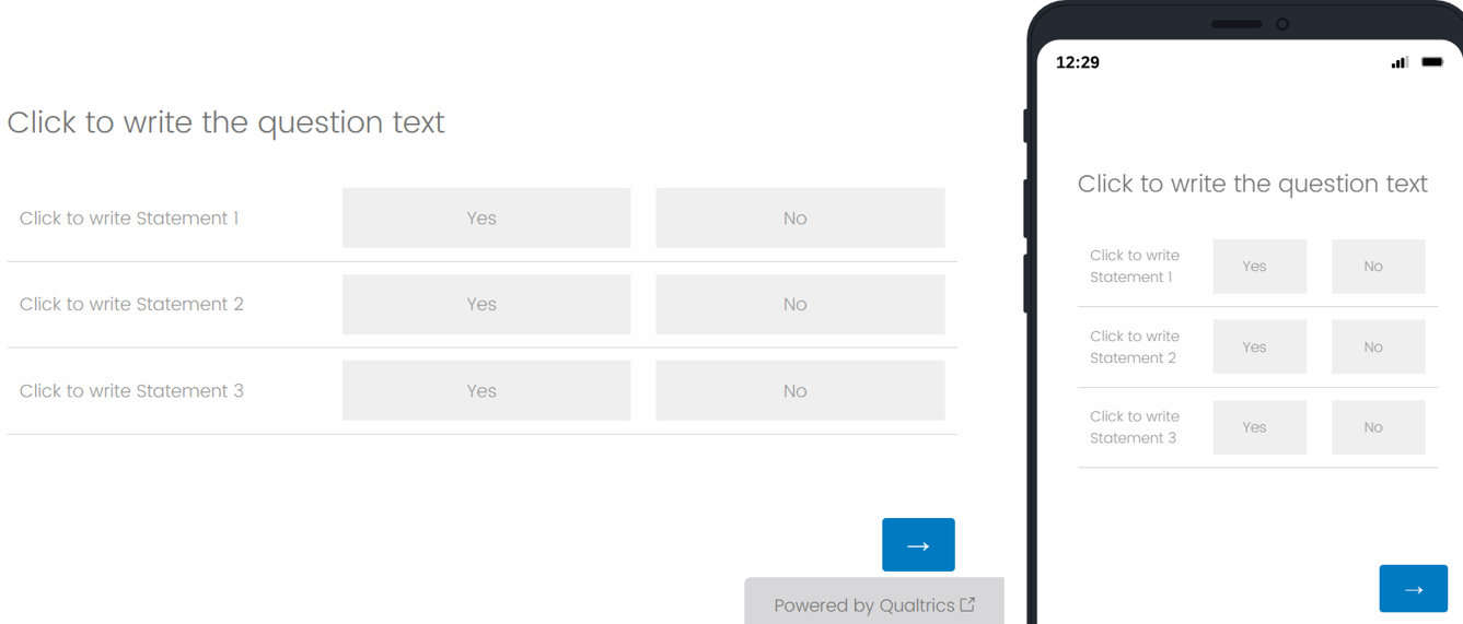
 For the 2nd option, create a Profile matrix question with 2 scale points and unselect Mobile Friendly. Then, add the below CSS to the Style section of the survey's Look & Feel.