Hi
Thank you so much for the previous answer. It was of great help
Currently, I’m working on a ‘Pick, Group and Rank’ question and I expect most of my respondents to fill this survey on a mobile phone.
In the question I’m asking the respondent to drag and drop the top 5 countries by their revenue contribution and then rank them in descending order.
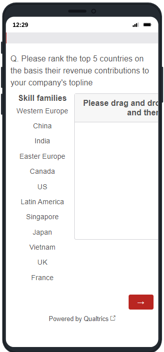
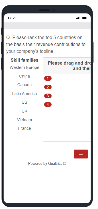
When I’m previewing this question in my mobile phone, the options added to the box are getting centrally aligned, hence are not visible to the respondent.
Attaching the screenshots from the preview section:
Question as visible on the mobile phone before moving the options to the box:

After adding the options to box:

As you can see the options added in the box are not visible thus making it extremely difficult for the respondent to re-arrange the options. I have already tried to left align each option but the options are still centrally aligned.
Could you please suggest a way of improving this visualization using JS or any other Qualtrics function (if possible). If not possible then could you please suggest another possible question format which I could change this question to (I was thinking of asking the respondent to first select the top 5 countries and then carrying forward these 5 selection options to the next question and asking the respondent to rank them. Though I would like to avoid splitting this into two questions as it is already a pretty long survey)
Any suggestion would be of great help!!


