Hello everyone,
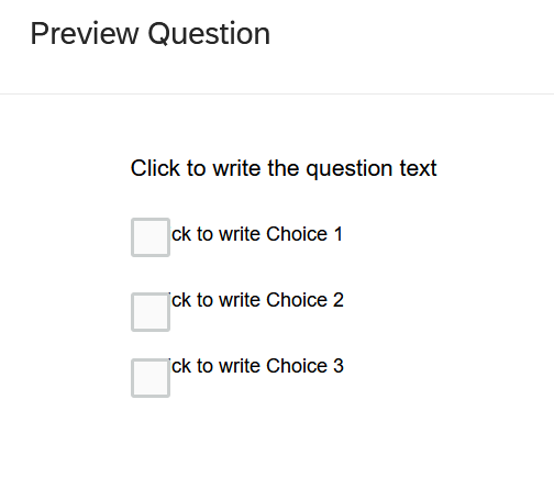
I am new to qualtrics and have been working on a quite long survey, which is done now, however with a major problem. That is, in multiple choice questions with Select Multiple the displayed question in preview does not follow the chosen layout (Modern/classic) in which the text is written inside the box, and instead shows the choices and check pots overlap which overlap as in the picture below. I know I can partly solve the overlap with Rich content editor (however then only either in the desktop OR mobile version), but this will not solve the layout problem... Note, when starting a new project, the issue is gone. To provide all information even though I do not think, this would have to do something with this problem: I had created the survey from a copy, in which I merely changed one thing in the qsf file in order to be able to use "edit multiple". I did so by following this, which worked perfectly fine, and I did not think it could be the reason for my problem, but I am mentioning it here to provide the full information.
https://www.qualtrics.com/community/discussion/1297/a-workaround-for-the-disappearing-edit-multipleAll help will be much appreciated!! I hope I will not have to redo the entire survey in a blank project :(
Select Multiple Error - Layout abandon and instead overlap of check pots and choices
Best answer by TomG
Check to see if you have custom CSS in Look & Feel. If so, deleting it may solve the issue.
Sign up
Already have an account? Login

Welcome! To join the Qualtrics Experience Community, log in with your existing Qualtrics credentials below.
Confirm your username, share a bit about yourself, then you're ready to explore and connect .
Free trial account? No problem. Log in with your trial credentials to join.
No free trial account? No problem! Register here
Already a member? Hi and welcome back! We're glad you're here 🙂
You will see the Qualtrics login page briefly before being taken to the Experience Community.
Login with Qualtrics

Welcome! To join the Qualtrics Experience Community, log in with your existing Qualtrics credentials below.
Confirm your username, share a bit about yourself, then you're ready to explore and connect .
Free trial account? No problem. Log in with your trial credentials to join. No free trial account? No problem! Register here
Already a member? Hi and welcome back! We're glad you're here 🙂
You will see the Qualtrics login page briefly before being taken to the Experience Community.
Login to the Community

Welcome! To join the Qualtrics Experience Community, log in with your existing Qualtrics credentials below.
Confirm your username, share a bit about yourself, then you're ready to explore and connect .
Free trial account? No problem. Log in with your trial credentials to join.
No free trial account? No problem! Register here
Already a member? Hi and welcome back! We're glad you're here 🙂
You will see the Qualtrics login page briefly before being taken to the Experience Community.
Login with Qualtrics

Welcome! To join the Qualtrics Experience Community, log in with your existing Qualtrics credentials below.
Confirm your username, share a bit about yourself, then you're ready to explore and connect .
Free trial account? No problem. Log in with your trial credentials to join. No free trial account? No problem! Register here
Already a member? Hi and welcome back! We're glad you're here 🙂
You will see the Qualtrics login page briefly before being taken to the Experience Community.
Enter your E-mail address. We'll send you an e-mail with instructions to reset your password.


