Comparisons with Widget Filters | XM Community
Skip to main content
Solved

Comparisons with Widget Filters

  • February 7, 2024
  • 3 replies
  • 251 views

nryalls
Level 3 ●●●
Forum|alt.badge.img+14

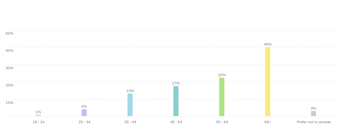
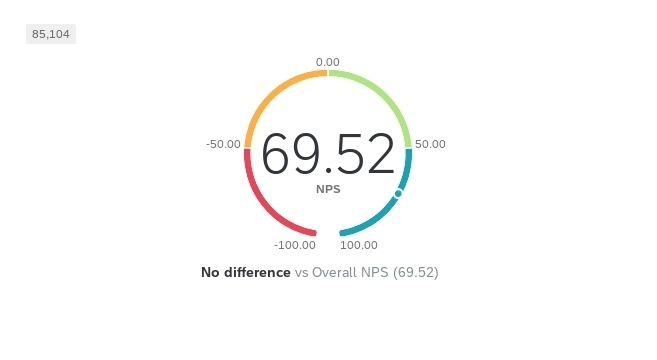
I am wondering if it is possible to have the ability to show a comparison based on a filter from another widget. Image 1 has my NPS gauge chart that has no filter. Image 2 is our percentage of visitors broken by age that I have selected to filter the page based on data point selected.

What I am wondering is: Can I have Image 1 show the filtered results and the comparison underneath show the difference from the overall NPS? 

(Image 1)


(Image 2)


Best answer by Sachin Nandikol

Hello @nryalls ,

I recommend trying a workaround by adding two gauge charts for the same question. In one chart, add a filter (Age of visitors = All) and then lock the filter. In the other widget, either don't add any filter or use the same widget already present in your dashboard. By doing so, when you click on any age bar, one gauge chart will automatically filter itself and display the data for that particular bar, while the other gauge chart will continue to show the current data. This should help you achieve the desired visualization and analysis.

Let me know if this helps.

3 replies

Sachin Nandikol
QPN Level 7 ●●●●●●●
Forum|alt.badge.img+45
  • QPN Level 7 ●●●●●●●
  • February 9, 2024

Hello @nryalls,

Please enable the checkbox located below the filter section in the bar chart. Once enabled, selecting any bar on the chart will automatically filter the dashboard to display data related specifically to that particular bar.
Let me know if this works.


nryalls
Level 3 ●●●
Forum|alt.badge.img+14
  • Author
  • Level 3 ●●●
  • February 9, 2024

@Sachin Nandikol - I do have that option selected, and then the results do shift on my other widgets as expected. What I would like to see however is the difference between that filtered result and unfiltered result on the gauge NPS widget. 

So where it says No difference vs. Overall NPS (69.52), I’d want it to say ^ 6 vs. Overall NPS. I’m not sure if this is a feature yet, or if it is in the roadmap for Qualtrics. But I think it would be really beneficial when looking at some key comparison metrics. 


Sachin Nandikol
QPN Level 7 ●●●●●●●
Forum|alt.badge.img+45
  • QPN Level 7 ●●●●●●●
  • Answer
  • February 9, 2024

Hello @nryalls ,

I recommend trying a workaround by adding two gauge charts for the same question. In one chart, add a filter (Age of visitors = All) and then lock the filter. In the other widget, either don't add any filter or use the same widget already present in your dashboard. By doing so, when you click on any age bar, one gauge chart will automatically filter itself and display the data for that particular bar, while the other gauge chart will continue to show the current data. This should help you achieve the desired visualization and analysis.

Let me know if this helps.