
Good morning all,
We’ve been moving over the last of our simple widgets to the new styles ready for 2024 but have hit an unexpected blockage. We have been using ‘Simple Chart’ widgets to show a particular source/touchpoint as the response volume vs score (where volume is a bar, score is a line) but this does not seem possible on the replacement widget types.
Would anyone be able to point out how this can be achieved, or if there is another widget type that can give this kind of view?
A different visualisation style would be acceptable if required - we are currently trying two widgets alongside each other in one of the new Group boxes for CX Dashboards.
Please see attached for an example of what we are trying to recreate, and thanks in advance for any help you may be able to give 😀

[CX Dashboard] Lines & bars on a single widget - is this possible on 'new' widget types?
Best answer by Anushree
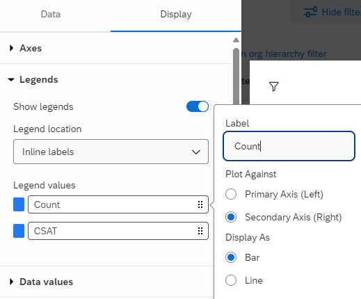
- Create a line chart widget and add both Volume and Score as metrics
- Click on Display» Legends
- Click on the volume metric and set Plot against as Secondary axis
- Set the Display as Bar
This will help to achieve the same visual as earlier where Volume metric can be displayed as Bar garph and Score metric as line graph in a single widget.

Sign up
Already have an account? Login

Welcome! To join the Qualtrics Experience Community, log in with your existing Qualtrics credentials below.
Confirm your username, share a bit about yourself, then you're ready to explore and connect .
Free trial account? No problem. Log in with your trial credentials to join.
No free trial account? No problem! Register here
Already a member? Hi and welcome back! We're glad you're here 🙂
You will see the Qualtrics login page briefly before being taken to the Experience Community.
Login with Qualtrics
Welcome! To join the Qualtrics Experience Community, log in with your existing Qualtrics credentials below.
Confirm your username, share a bit about yourself, then you're ready to explore and connect .
Free trial account? No problem. Log in with your trial credentials to join. No free trial account? No problem! Register here
Already a member? Hi and welcome back! We're glad you're here 🙂
You will see the Qualtrics login page briefly before being taken to the Experience Community.
Login to the Community
Welcome! To join the Qualtrics Experience Community, log in with your existing Qualtrics credentials below.
Confirm your username, share a bit about yourself, then you're ready to explore and connect .
Free trial account? No problem. Log in with your trial credentials to join.
No free trial account? No problem! Register here
Already a member? Hi and welcome back! We're glad you're here 🙂
You will see the Qualtrics login page briefly before being taken to the Experience Community.
Login with Qualtrics
Welcome! To join the Qualtrics Experience Community, log in with your existing Qualtrics credentials below.
Confirm your username, share a bit about yourself, then you're ready to explore and connect .
Free trial account? No problem. Log in with your trial credentials to join. No free trial account? No problem! Register here
Already a member? Hi and welcome back! We're glad you're here 🙂
You will see the Qualtrics login page briefly before being taken to the Experience Community.
Enter your E-mail address. We'll send you an e-mail with instructions to reset your password.