How to show NPS breakdown by week in a dashboard | XM Community
Skip to main content
Solved

How to show NPS breakdown by week in a dashboard

  • October 17, 2025
  • 2 replies
  • 29 views

Forum|alt.badge.img+3
  • Level 2 ●●
  • 12 replies

Hiya,

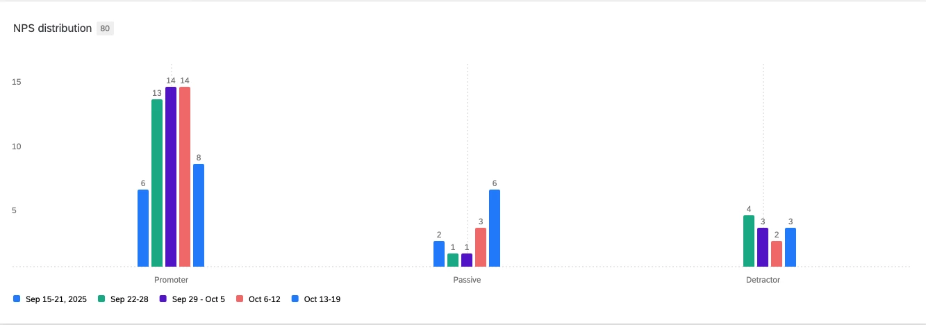
I’ve setup a vertical bar widget to show the breakdown of NPS over time.

Currently its showing each week against promoter, passive, detractor.

Is there a way to flip the axis so time is the X axis and for each week it shows the breakdowns?


Current setup:


Best answer by bench

@TimOH 

If that is Vertical Bars, from what I can see you have response category (promoter, passive, detractor) in the X-axis and ‘response week’ in the Data Series.

Try swap them around so X-axis has ‘response week’ and Data Series has response category.

This has worked for me in the past.

2 replies

bench
Level 2 ●●
Forum|alt.badge.img+4
  • Level 2 ●●
  • 51 replies
  • Answer
  • October 17, 2025

@TimOH 

If that is Vertical Bars, from what I can see you have response category (promoter, passive, detractor) in the X-axis and ‘response week’ in the Data Series.

Try swap them around so X-axis has ‘response week’ and Data Series has response category.

This has worked for me in the past.


Forum|alt.badge.img+3
  • Author
  • Level 2 ●●
  • 12 replies
  • October 19, 2025

@TimOH 

If that is Vertical Bars, from what I can see you have response category (promoter, passive, detractor) in the X-axis and ‘response week’ in the Data Series.

Try swap them around so X-axis has ‘response week’ and Data Series has response category.

This has worked for me in the past.

Thank you!