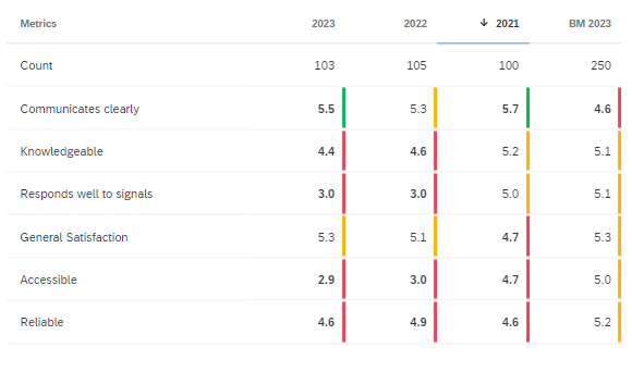
Hi! In a dashboard I have a normal table shoring the results (10-point scale) for certain metrics coming from 3 survey (2021, 2022, 2023) + a benchmark. Right now, I applied conditional formatting to colour the lowest scores red, the average scores yellow, the highest green.
I would do something differen: the scores from previous years and the benchmark should color either green or red depending on how much they differ from those of the last survey (2023). So if there is more than a -0,5 point difference the score should be red, if more than +0,5 difference green.
Is this possible? Or should I organize things differently?