EX Matrix table responses in Dashboard | Experience Community
Skip to main content

EX Matrix table responses in Dashboard

  • March 27, 2026
  • 7 replies
  • 28 views

Forum|alt.badge.img+2

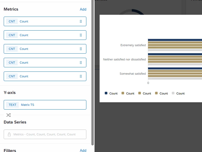
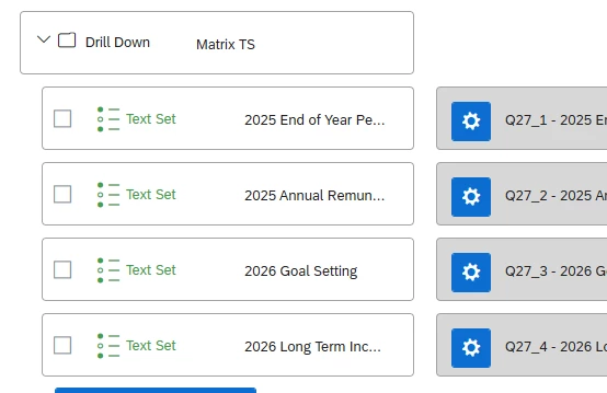
I am following the instructions linked below to build one widget that reflects the responses collected from a Matrix table question in an EX project. I cannot get it to work, I feel like mine is “upside down”… When I get to step 5/6 instead of showing the statements on the Y axis I’m getting the responses.

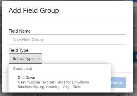
Then when I change the metric to “top/bottom box” it tells me “Metric requires field or field no longer exists - try updating the metric field”. So when I try change the Y-axis matrix to break out by value and it says “Multiple metrics are not supported with a field group dimension broken out by value.”


It’s likely an easy fix that I’m completely overlooking. 


https://www.qualtrics.com/support/vocalize/common-use-cases-voc/viewing-matrix-statements-in-a-single-widget/


7 replies

  • Level 4 ●●●●
  • March 27, 2026

From the image which you provided, I can see that the mapping might be wrong. 

In the above widget, Y-axis is displaying as Extremely satisfying without changing anything in the Metrics field. 


Ensure you map the fields like it mentioned in the link above..


Forum|alt.badge.img+2
  • Author
  • Level 2 ●●
  • March 30, 2026

From the image which you provided, I can see that the mapping might be wrong. 

In the above widget, Y-axis is displaying as Extremely satisfying without changing anything in the Metrics field. 


Ensure you map the fields like it mentioned in the link above..


You could be right, when I map the fields, I can only map and group them as a “text set”. If I map the questions as a number set I’m unable to group them. This is the only difference between the instructions in the link and what I have in my dashboard. 


  • Level 4 ●●●●
  • March 30, 2026

I can see that you are using “drill down” group instead of “measure group”. Try to map under “measure group”.


Forum|alt.badge.img+2
  • Author
  • Level 2 ●●
  • March 30, 2026

Drill down is the only option we have for field groups. 


vgayraud
QPN Level 7 ●●●●●●●
Forum|alt.badge.img+63
  • QPN Level 7 ●●●●●●●
  • March 31, 2026

Hi,

Measure groups are not available in EX dashboards and the use case support page you are referring to is specifically for CX dashboards. As far as I know, it is not possible to obtain that exact visualisation in EX.


Forum|alt.badge.img+3
  • QPN Level 1 ●
  • March 31, 2026

Hi,

I believe what you need to do is create a category to group all the questions from your matrix table. Categories act as a type of measure group in EX Dashboards.


https://www.qualtrics.com/support/employee-experience/creating-ee-project/dashboards-tab/dashboard-management/dashboard-settings/categories-ee/


Once you’ve created your category, you’ll be able to set it as your Y-axis.


My labels are in French, but here’s an example showing the distribution of my answer choices on the X-axis (Totally disagree, Disagree, Neither agree nor disagree, Agree, Totally agree) for three questions included in my “Bien-être” (Wellbeing) category on the Y-axis.


Forum|alt.badge.img+2
  • Author
  • Level 2 ●●
  • March 31, 2026

Hi,

Measure groups are not available in EX dashboards and the use case support page you are referring to is specifically for CX dashboards. As far as I know, it is not possible to obtain that exact visualisation in EX.

That’s good to know. I now need to figure out how to display this data!