Hi all-
We have a company logo, which I'd like to keep in the header/theme.
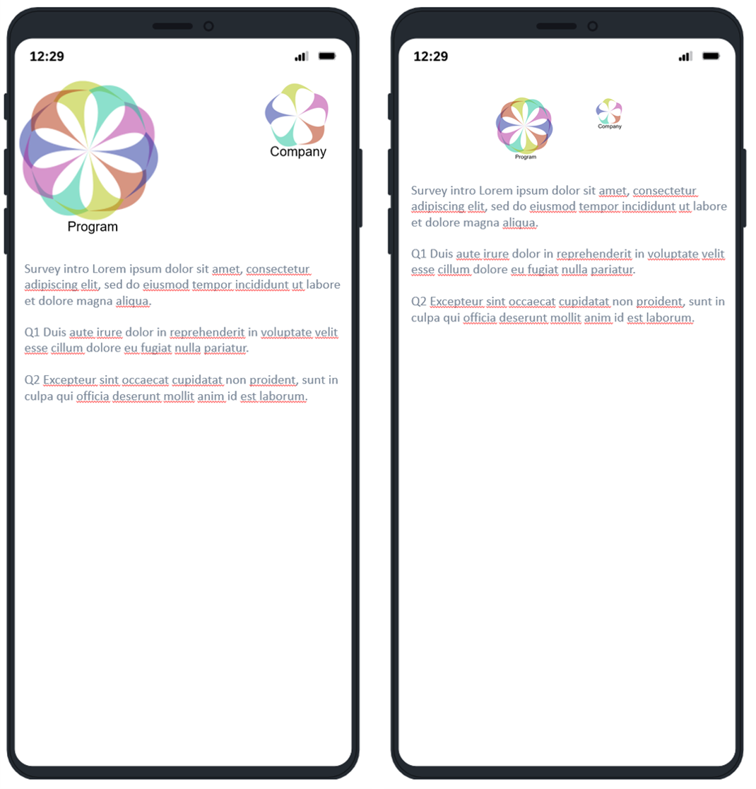
For this survey, we have an additional program logo that will likely be larger than the company logo, located above the first question.
I gave up on putting the program logo as a graphic item within the survey itself, it wastes a lot of screen space being placed below the theme logo. When I try to create a combo image to replace the theme logo, I can't figure out how to optimize the sizing.
Currently I'm just placing both images in powerpoint and saving as a combined image, based on the relative size of the two images and how far apart they might be if the logo was maximized for the width on mobile (the same size could be used for the browser version as well)
So basically, I'm trying to accomplish the first picture, but ending up with the second. I welcome any suggestions on how to maximize the logo width for mobile (whether that is a setting, a change in the original picture size, or anything else!)
Best practices for logo sizing (in theme?)
Best answer by AlwaysLearning
Figured it out, but couldn't figure out how to delete my question/post
I ended up using the max size logo setting, and just kept increasing it until it looked ok on mobile
Sign up
Already have an account? Login

Welcome! To join the Qualtrics Experience Community, log in with your existing Qualtrics credentials below.
Confirm your username, share a bit about yourself, then you're ready to explore and connect .
Free trial account? No problem. Log in with your trial credentials to join.
No free trial account? No problem! Register here
Already a member? Hi and welcome back! We're glad you're here 🙂
You will see the Qualtrics login page briefly before being taken to the Experience Community.
Login with Qualtrics

Welcome! To join the Qualtrics Experience Community, log in with your existing Qualtrics credentials below.
Confirm your username, share a bit about yourself, then you're ready to explore and connect .
Free trial account? No problem. Log in with your trial credentials to join. No free trial account? No problem! Register here
Already a member? Hi and welcome back! We're glad you're here 🙂
You will see the Qualtrics login page briefly before being taken to the Experience Community.
Login to the Community

Welcome! To join the Qualtrics Experience Community, log in with your existing Qualtrics credentials below.
Confirm your username, share a bit about yourself, then you're ready to explore and connect .
Free trial account? No problem. Log in with your trial credentials to join.
No free trial account? No problem! Register here
Already a member? Hi and welcome back! We're glad you're here 🙂
You will see the Qualtrics login page briefly before being taken to the Experience Community.
Login with Qualtrics

Welcome! To join the Qualtrics Experience Community, log in with your existing Qualtrics credentials below.
Confirm your username, share a bit about yourself, then you're ready to explore and connect .
Free trial account? No problem. Log in with your trial credentials to join. No free trial account? No problem! Register here
Already a member? Hi and welcome back! We're glad you're here 🙂
You will see the Qualtrics login page briefly before being taken to the Experience Community.
Enter your E-mail address. We'll send you an e-mail with instructions to reset your password.
