Hi everyone,
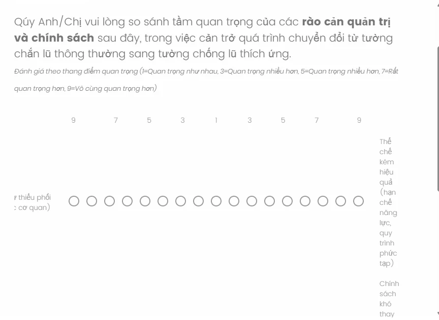
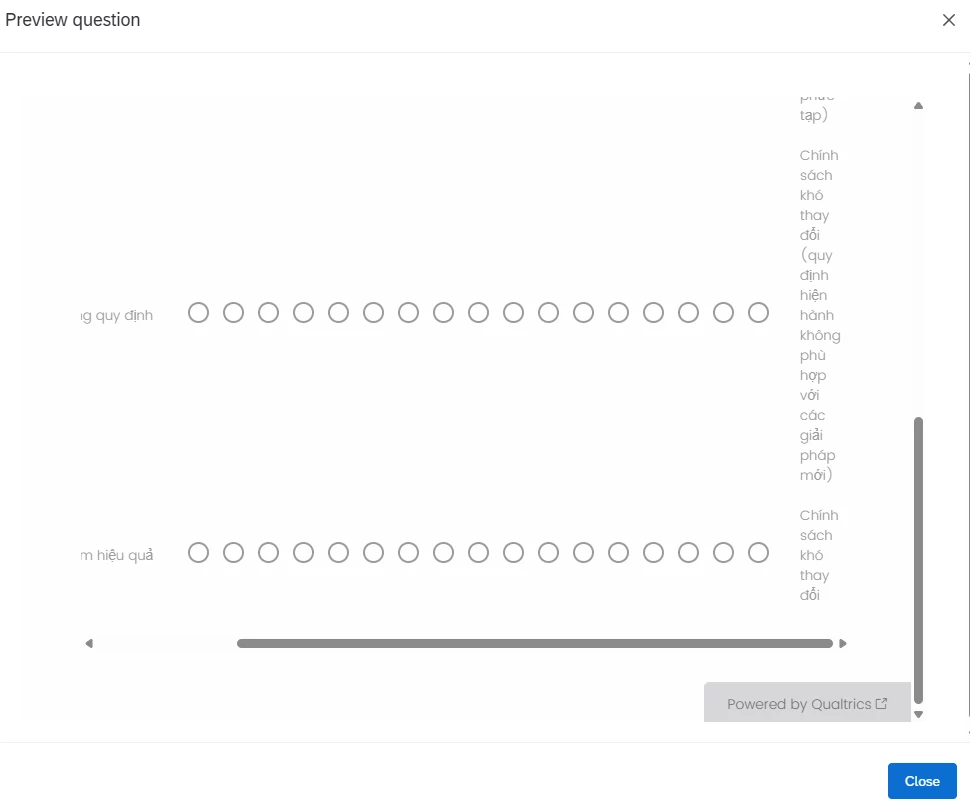
I'm currently designing a survey with a bipolar matrix using a 17-point scale for AHP (Analytic Hierarchy Process) pairwise comparisons.
The issue I’m facing is that the right-side labels (please refer to the attached screenshots below) are stacked vertically with one word per line — they don’t wrap naturally like the left-side labels.
I’ve tried various CSS and JavaScript solutions, including changing width, white-space, word-break, and table-layout, but nothing seems to fix it completely. Qualtrics Support confirmed this is a known limitation when using a wide matrix like this.
Has anyone successfully styled a 17-point bipolar matrix with properly wrapped right-hand labels? Or has anyone found a better workaround while keeping the AHP logic intact?
Any advice, custom code, or example setups would be greatly appreciated!
Many thanks in advance,
Bao