I have a survey with a few Likert Matrices with the following format: Multiple questions asking for respondents to rate their satisfaction with different areas of their employment on the scale: Excellent, Good, Average, Poor, Very Poor.
I also have a report for this survey, and I see that I can display these matrix results in a data table or a statistics table.
Here is where I am looking for help. I would like to display the results for each matrix in the following format, in a Qualtrics report:
Above average (Group Excellent and Good)
Average
Below average (Group Poor and Very Poor)
Additionally, I would prefer to display these as percentages or proportions, rather than counts.
I have gotten pretty close to what I would want using a statistics table with top box and bottom box, but I am not sure how to also show the proportion of average results in that format.
Thank you very much for any help or suggestions, I really appreciate it!
Best answer by Tom_1842
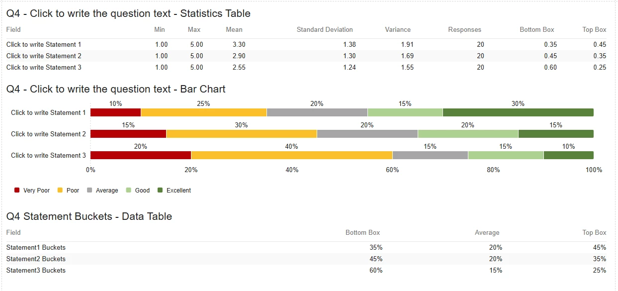
The settings look different because I think Peeyush is using the Legacy Results-Reports and you are working in the Reports tab. If your mean values are in the 7s, I would check on the Recode values of the Matrix question scale points. You probably want them to be 1 to 5, where 1 is Very Poor and 5 is Excellent. The Recode values will also affect what gets considered a top box/bottom box to the Statistics Table, where 1 and 2 are bottom and 4 and 5 are top. The value depicted in the statistics table for bottom/top boxes is the proportion of respondents that fit into that box. In the below example for statement 1, the statistics table shows a top box of "0.45", and the bar chart depicts "Good" at "15%" and "Excellent" at "30%" which sums to 45%.
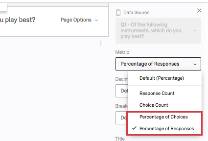
I am not sure how to include the proportion of respondents that select "Average" in the statistics table. However, you can make your own fields using Bucketing which can group the options into 3 buckets: “Top Box”, “Average”, “Bottom Box”. The created fields can then be included in a Data Table which will resemble the format of the Statistics table. The metric type can be adjusted to be percentages.
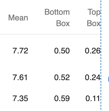
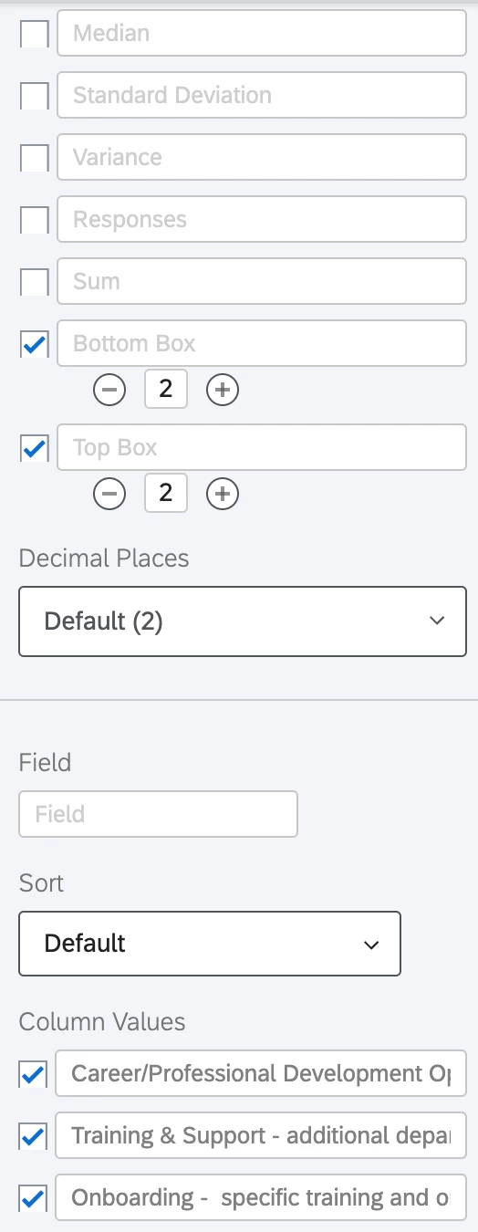
Thank you very much for the information. Unfortunately, in my statistics table I see slightly different settings, and I am not sure why.
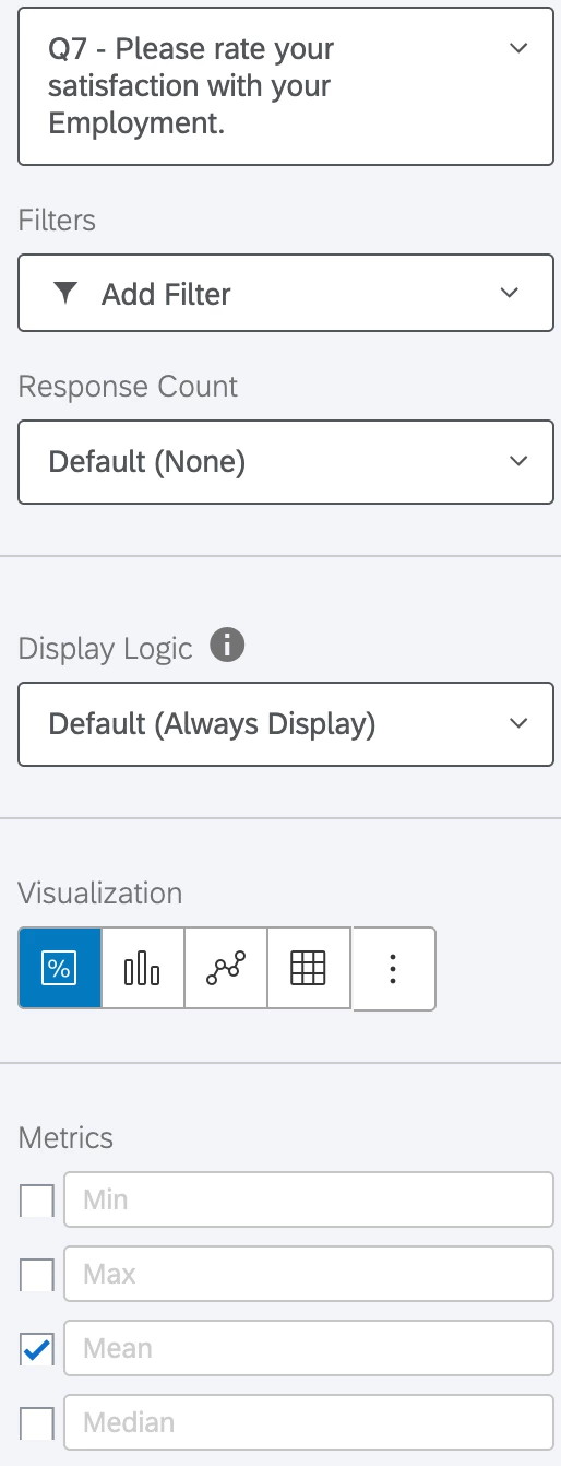
To get here, I:
Hit Insert > Questions > My Likert Matrix Question
Ensured the visualization was set to statistics table
Set top box to 2 and bottom box to 2
At this point, if I select Mean it gives a number around 8, while top and bottom box are both between 0 and 1. Additionally, I am not seeing a metric dropdown.
Here are some photos to try and further explain. Thank you again for the help!
Below this is just the option to remove the visualization.
The settings look different because I think Peeyush is using the Legacy Results-Reports and you are working in the Reports tab. If your mean values are in the 7s, I would check on the Recode values of the Matrix question scale points. You probably want them to be 1 to 5, where 1 is Very Poor and 5 is Excellent. The Recode values will also affect what gets considered a top box/bottom box to the Statistics Table, where 1 and 2 are bottom and 4 and 5 are top. The value depicted in the statistics table for bottom/top boxes is the proportion of respondents that fit into that box. In the below example for statement 1, the statistics table shows a top box of "0.45", and the bar chart depicts "Good" at "15%" and "Excellent" at "30%" which sums to 45%.
I am not sure how to include the proportion of respondents that select "Average" in the statistics table. However, you can make your own fields using Bucketing which can group the options into 3 buckets: “Top Box”, “Average”, “Bottom Box”. The created fields can then be included in a Data Table which will resemble the format of the Statistics table. The metric type can be adjusted to be percentages.
@Tom_1842 Thank you very much for this, it is now working great! I ended up doing the bucketing, and putting those into a data table, and it looks fantastic. I really appreciate it. Also, I appreciate the suggestions from Peeyush above, and I think if I was doing the report in the results tab, that would have been great.