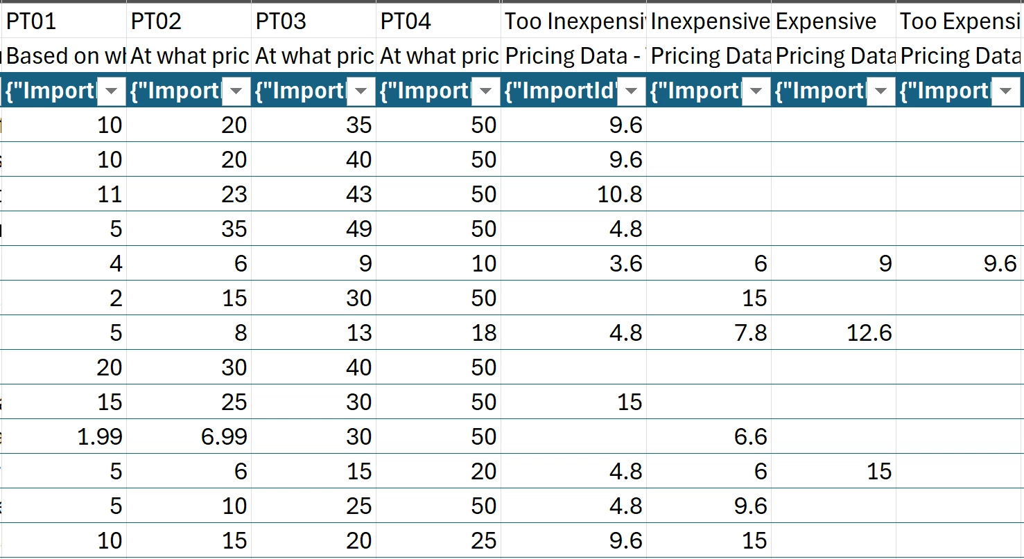
We are running a pricing study, and using the Van Westendorp pre-built Qualtrics survey for the first time. While we know conceptually about how to graph and use the 4 variables (we won’t be using Qualtrics’ internal graphing, due to data cleaning being done outside of the platform), but when we checked out data, we see that Qualtrics has created 4 additional variables that differ from the direct responses the participants entered.
They’re called “Pricing Data - Too Inexpensive/Inexpensive/Expensive/Too Expensive”. We can’t figure out, nor find any documentation on, how Qualtrics is calculating these new variables and what they mean. As you can see, most all of the values are getting discounted from the original submitted values, and the vast majority are blank?? If it matters, we did set an upper and lower price limit of $1-$50 (the item is a premium version of a CPG usually in the $5-15 range).
Does anyone have insight into what these variables are, how they’re being calculated, why so many are ignored/left blank, and why we should trust using them rather than simply graphing the actual results from the participants (outliers removed)?
Best answer by rochak_khandelwal
Hi @egaleza,
Auto-generated variables: The additional fields you’re seeing (Too Inexpensive, Inexpensive, Expensive, Too Expensive under “Pricing Data”) are not raw responses but derived estimates computed using interpolation across cumulative frequency curves based on the four price-point questions: • Too Cheap (PT01) • Cheap (PT02) • Expensive (PT03) • Too Expensive (PT04)
The values Qualtrics generates (e.g., “Inexpensive: 6.6”) are estimated price points where key intersections occur on the Price Sensitivity Graph: • Point of Marginal Cheapness (PMC) • Point of Marginal Expensiveness (PME) • Optimal Price Point (OPP) • Indifference Price Point (IDP)
These are derived using the intersection of the cumulative percentages of each response group (e.g., % of respondents who said “Too Cheap” at or below price X). Qualtrics applies interpolation or smoothing and returns estimated intersection prices.
So if you’re seeing values that don’t match raw inputs, that’s expected behavior — it’s because the model estimates those points using aggregated cumulative data (not just individual response entries).
Blank cells: Those values are only shown for respondents whose answers allow a clean interpolation or estimation across the 4 questions. If any of the 4 PT01–PT04 entries are missing or logically inconsistent (e.g., Too Cheap > Expensive), or if the interpolation fails (e.g., flat distributions, ties),
Qualtrics won’t return a value for that respondent. This is why you’re seeing so many blank cells.
Trusing them: If you’re analyzing outside Qualtrics, it’s often better to work with raw values (PT01–PT04), clean out illogical or incomplete responses. Generate aggregate curves in R/Python/Excel, and derive the 4 intersection points from cumulative plots. Like you mentioned as well. But if you’re looking for quick benchmarking or visualization, the pre-calculated values Qualtrics provides are still based on solid logic — just aggregated.