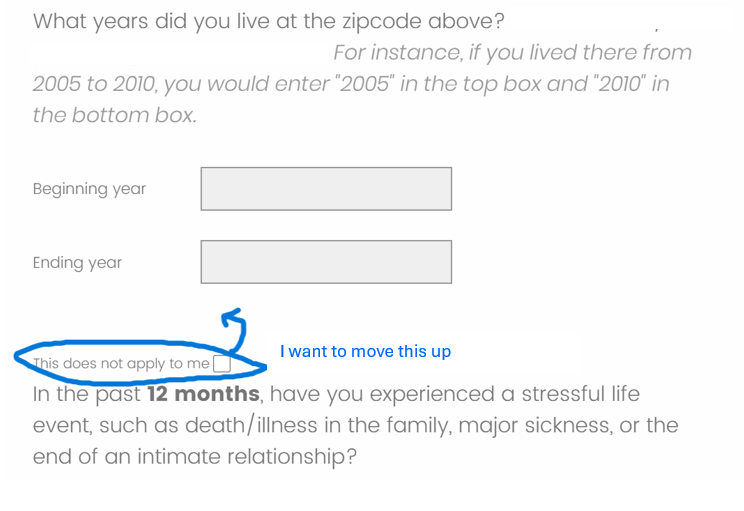
Hello, I am a student that's fairly new to using Javascript to format questions in Qualtrics. I have a form field question where I needed to also add a checkbox if the question was not applicable to the respondent, which I have done. However, the checkbox is situated too close to the next question when publishing the survey. Does anyone know how to move the checkbox and “this does not apply to me” further up??

Here is the code I’m using for “this does not apply to me”:
Qualtrics.SurveyEngine.addOnload(function() {
// Get the form field question by its question ID
var formFieldQuestionId = 'QID54'; // Replace 'QID37' with the actual question ID
var formFieldQuestion = $(formFieldQuestionId);
// Create a new checkbox element
var checkbox = document.createElement('input');
checkbox.type = 'checkbox';
checkbox.id = 'myCheckbox';
checkbox.name = 'myCheckbox';
// Create a label for the checkbox
var label = document.createElement('label');
label.htmlFor = 'myCheckbox';
label.appendChild(document.createTextNode('This does not apply to me'));
// Insert the checkbox and label after the form field question
formFieldQuestion.insertAdjacentElement('afterend', checkbox);
formFieldQuestion.insertAdjacentElement('afterend', label);
});
And here is the code for the checkbox that I’m currently using in Rich Content Editor:
<style type="text/css">.Skin input[type=checkbox] {
position: relative; top:5px !important;
opacity: 1 !important;
z-index: 999 !important;
height: 20px !important;
width: 20px !important;
}
#QID48\~track {
margin: 50px !important;
}
</style>
I got the Javascript code for both the text and the checkbox here;
Any and all help would be greatly appreciated!!


