Hi Qualtrics Community,
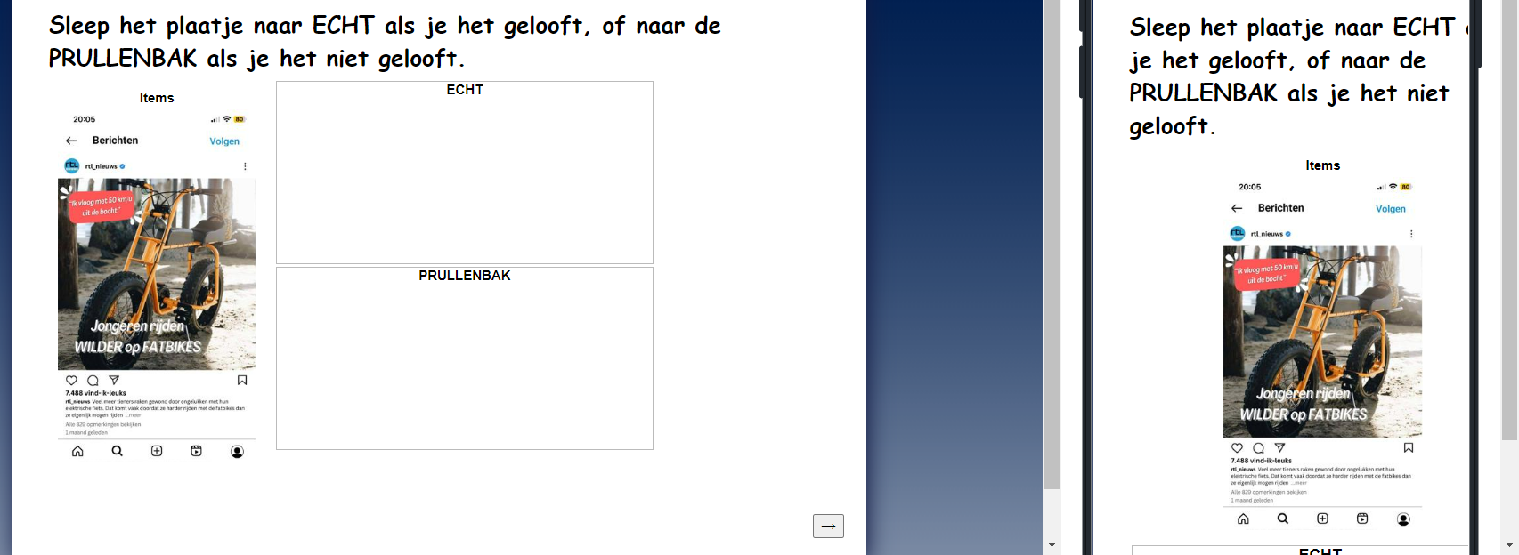
I’m currently working on a survey that includes drag-and-drop questions, and I’m having trouble optimizing them for mobile devices. Here's the situation:

The Problem:
I want to ensure that my drag-and-drop questions fit properly on mobile screens without requiring horizontal scrolling. Specifically, I need the following:
- Mobile responsiveness: The items, groups, and containers should shrink or adjust based on the screen size, ensuring that everything fits within the mobile screen and the navigation button remains visible without any scrolling.
- Resizing: The drag-and-drop elements (choices, boxes, etc.) should automatically resize for smaller screens, like on mobile phones and tablets.
- Viewport scaling: I’ve added the
<meta name="viewport" content="width=device-width, initial-scale=1.0">tag, but the layout still doesn’t adjust properly on mobile devices.
What I’ve Tried:
- Implemented CSS media queries for mobile devices to resize elements like the containers, list items, and groups.
- Added JavaScript to dynamically check screen size and adjust the layout (e.g., switching between flex and block display).
- Played around with
min-height,width,box-sizing, and other CSS properties, but I’m still seeing issues where items don’t shrink as expected, or the layout overflows horizontally on smaller devices.
Here’s the CSS I’m using:
/* Base styles */
.Skin .PGR .DragAndDrop {
    width: 100% !important;
    box-sizing: border-box;
}

/* Mobile View Adjustments */
@media (max-width: 480px) {

    /* Full width for group headers */
    .Skin .PGR .DragAndDrop .Group h2 {
        width: 100% !important;
        font-size: 14px !important;
        text-align: center !important;
    }

    /* Stack groups vertically */
    .Skin .PGR .DragAndDrop .Group {
        width: 100% !important;
        margin-bottom: 10px !important;
    }

    /* Adjust list items to fit better */
    .Skin .PGR .DragAndDrop .QuestionBody .Group > div > ul > li,
    .Skin .RO .DND > ul > li {
        width: calc(50% - 10px) !important; /* Adjust width for mobile */
        margin: 5px !important; /* Adjust spacing */
        padding: 5px !important;
        box-sizing: border-box;
    }

    /* Flexbox for items */
    .Skin .PGR .DragAndDrop .Items {
        width: 100% !important;
        display: flex !important;
        flex-wrap: wrap !important; /* Wrap items */
        justify-content: center !important;
        box-sizing: border-box;
    }

    /* Reduce min-height for mobile */
    .Skin .PGR .DragAndDrop td.itemsContainerTd {
        min-height: 150px !important; /* Adjust height for mobile */
    }

    /* Ensure navigation buttons are visible */
    .Skin .PGR .DragAndDrop .advanceButtonContainer {
        display: flex !important;
        justify-content: center !important;
        margin-top: 10px !important;
    }

    .Skin .PGR .DragAndDrop .advanceButtonContainer .advanceButton {
        padding: 10px 20px !important;
        font-size: 16px !important;
    }
}
Here’s the JavaScript I’m using:
Qualtrics.SurveyEngine.addOnload(function() {
    // Get the question ID
    var qid = this.questionId;
    var container = '#' + qid + ' > div.Inner.BorderColor.DragAndDrop';

    // Function to adjust layout for mobile view
    function adjustForMobile() {
        var itemContainer = jQuery(container + ' td.itemsContainerTd');
        var groups = jQuery(container + ' td.groupsContainerTd.BorderColor');

        // Adjust the item container to fit mobile view
        itemContainer.css({
            'min-height': '150px',  // Adjusted height for mobile
            'display': 'block',     // Stack the item container
            'width': '100%'         // Full width for mobile
        });

        // Adjust the group containers to stack vertically
        groups.css({
            'display': 'block',
            'width': '100%',        // Make groups full width on mobile
            'margin-bottom': '10px' // Add spacing between the stacked groups
        });
    }

    // Function to reset layout for desktop view
    function adjustForDesktop() {
        var itemContainer = jQuery(container + ' td.itemsContainerTd');
        var groups = jQuery(container + ' td.groupsContainerTd.BorderColor');

        // Reset the item container for desktop
        itemContainer.css({
            'min-height': '250px',  // Original height for desktop
            'display': 'flex',      // Centered layout for desktop
            'justify-content': 'center',
            'align-items': 'center',
            'width': 'auto'         // Let it size based on content
        });

        // Reset the group containers for desktop
        groups.css({
            'display': 'table-cell',
            'width': 'auto',        // Original side-by-side layout
            'margin-bottom': '0'    // No extra spacing needed between groups
        });
    }

    // Function to check the screen width and apply appropriate layout
    function checkScreenWidth() {
        var screenWidth = jQuery(window).width();
        if (screenWidth <= 480) {
            // Adjust layout for mobile view
            adjustForMobile();
        } else {
            // Adjust layout for desktop view
            adjustForDesktop();
        }
    }

    // Run the screen size check when the page loads and when the window is resized
    checkScreenWidth();
    jQuery(window).resize(checkScreenWidth);
});

Qualtrics.SurveyEngine.addOnReady(function() {

});

Qualtrics.SurveyEngine.addOnUnload(function() {

});
Key Questions:
- How can I properly adjust the layout so that the drag-and-drop question fits within the mobile screen without any scrolling?
- Is there a recommended method for ensuring the drag-and-drop elements auto-resize based on the device’s screen size?
- Are there any specific tips or scripts that have worked well for others dealing with drag-and-drop questions on mobile?
Affected Questions:
I have multiple questions that require drag-and-drop functionality, and I want to make sure these work smoothly across devices (desktop, tablet, and mobile).
Thank you in advance for your help!


