Hello,
I am building a survey in Qualtrics.
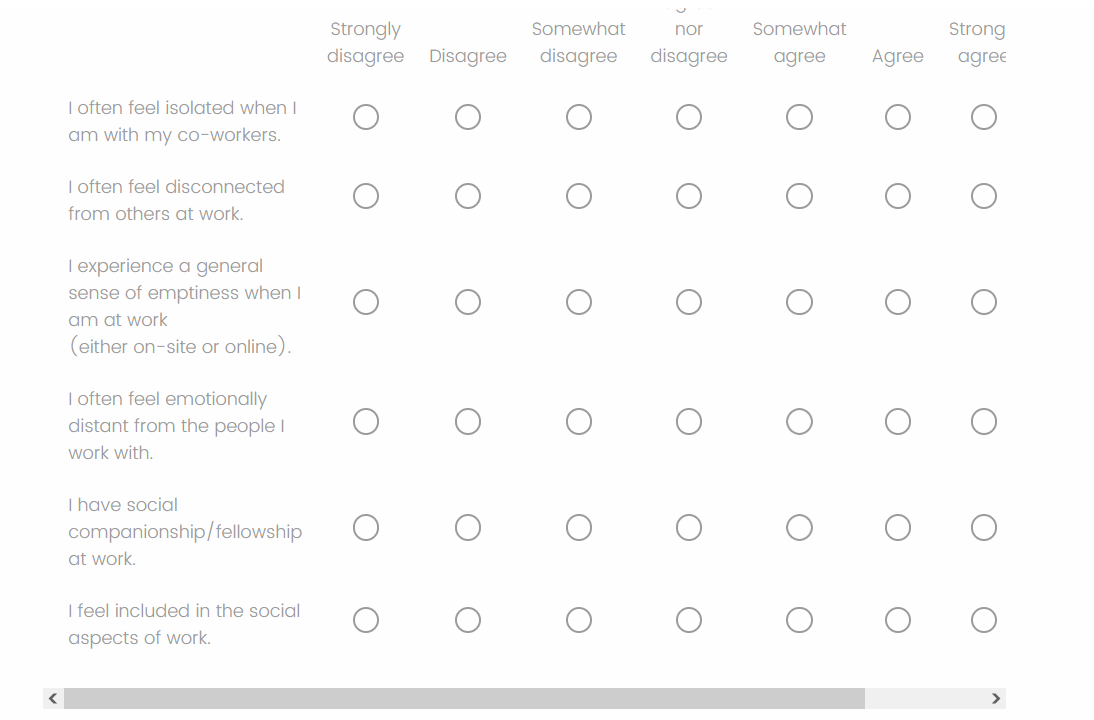
For one set of questions, the following issue shows up in answer choices. This is from preview of the survey. 
The participants would need to move the slider to answer.
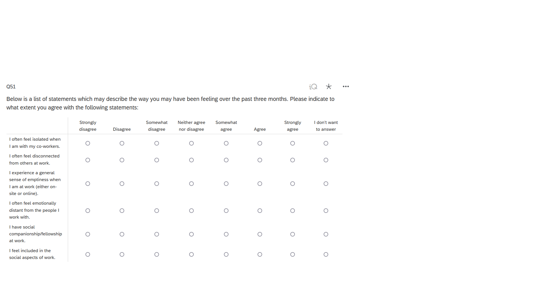
This is the design interface:
This is probably due to the tables I use but such an issue does not happen in other formats, only in this table. I was using a Qualtrics theme and once I changed that theme, things got messed up.
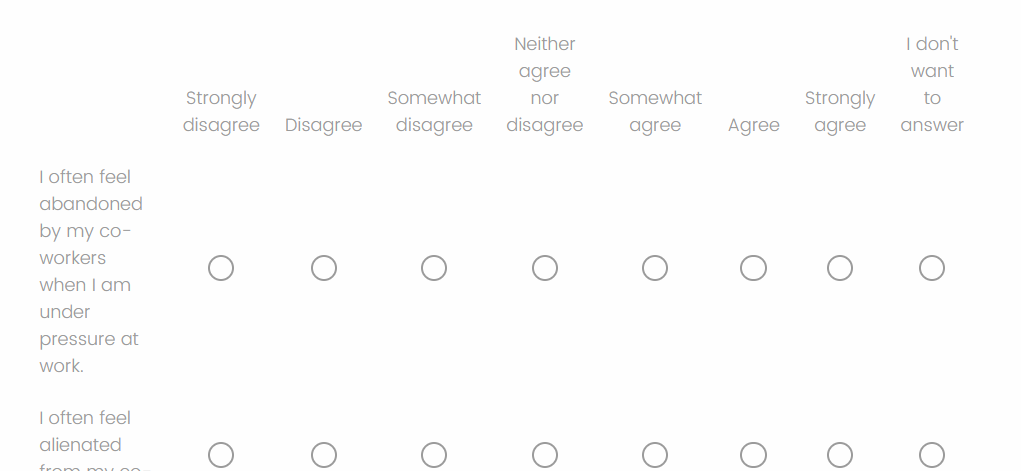
For instance, this one is normal- form preview:
What I tried so far, and did not work:
- Copy-pasting the last table and inserting the statements in the first table.
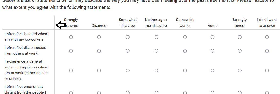
- Moving the answer column to the left as in the picture below:

Any other ideas? Thank you very much in advance,
Ada


