Targeting slider progress circle for custom CSS | XM Community
Skip to main content

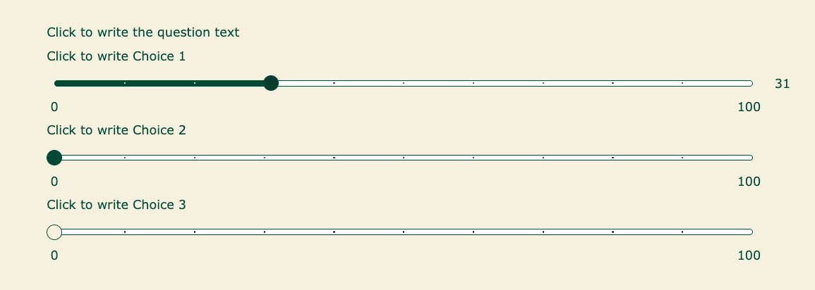
While I saw a couple questions related to the slider, I’m trying to change the default and hover states for the circle portion of the slider question. I’ve inspected with dev tools and while I’ve been able to figure out where the hover state is triggered, I can’t actually see any styles changing in the CSS to be able to change them.

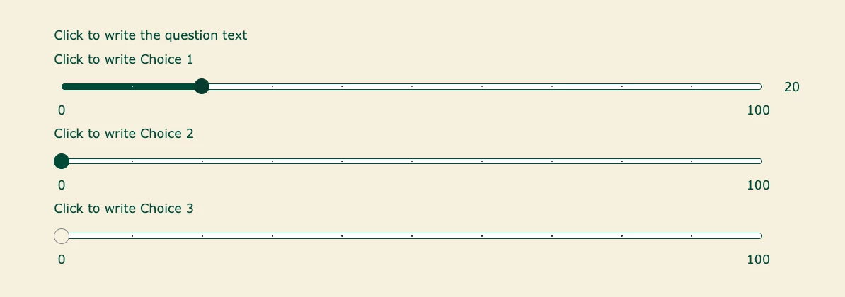
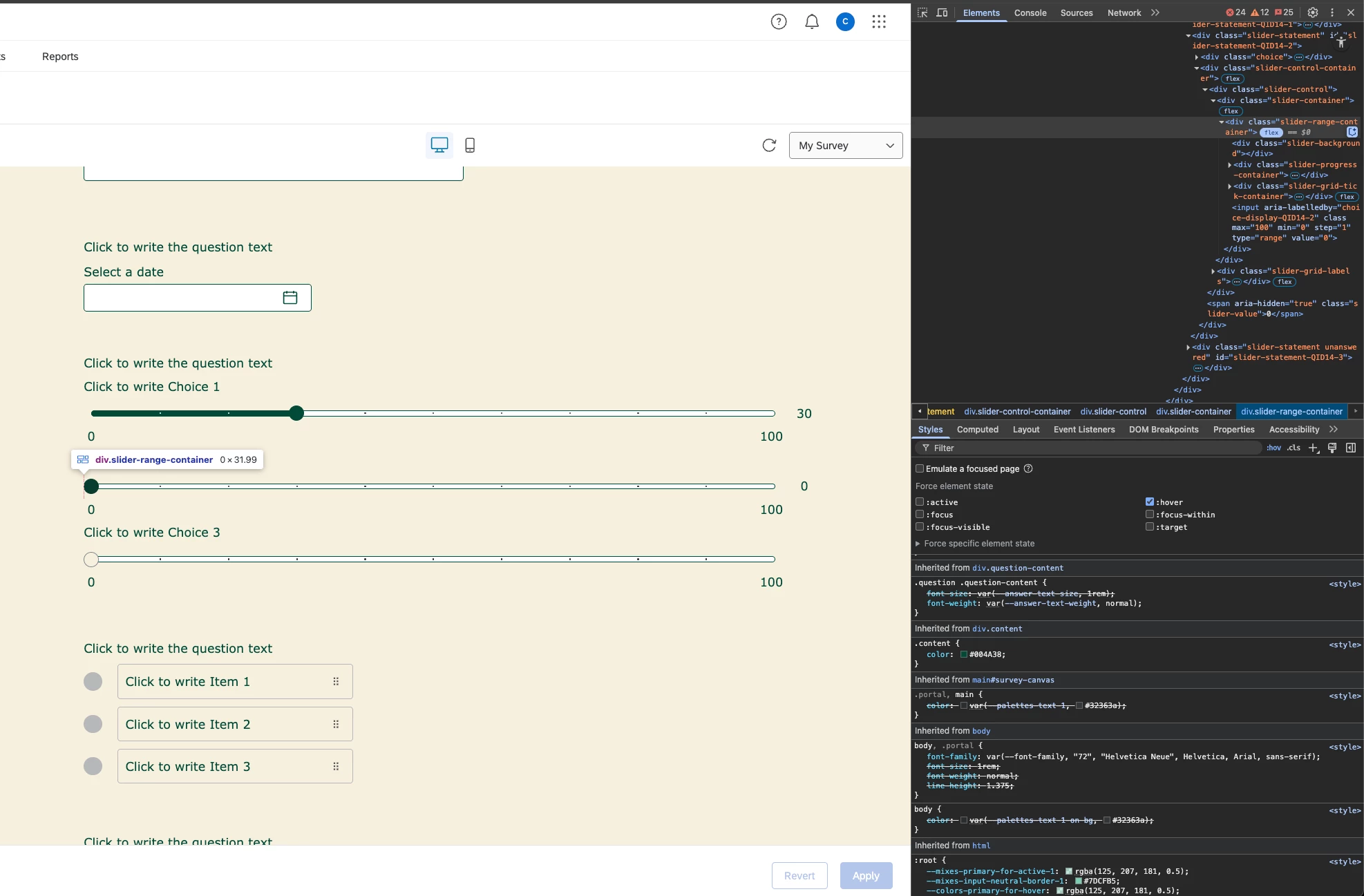
My goal is to have the circle be a specific green by default, not this beige color by default, like shown in the middle slider (I have it’s hover state toggled on). And I don’t want it to have a hover color of that green mixed with black which the top slider shows. So I’m not sure if anyone can help me figure out how to actually target the styles for that slider circle. I’ve gone as specific as I can figure out in the inspect dev tools and the hover state is actually a higher level div which to me makes no sense. But again, I still don’t see any styles defined for it’s different hover states either so that I can change them.

Hi,

/* WebKit (Chrome, Safari, Edge) */
.slider.handle .slider-range-container input[type="range"]::-webkit-slider-thumb {
background: green !important;
border-color: green !important;
}

/* Firefox */
.slider.handle .slider-range-container input[type="range"]::-moz-range-thumb {
background: green !important;
border-color: green !important;
}


@vgayraud Hi! Thank you for this. 

Hi,

/* WebKit (Chrome, Safari, Edge) */
.slider.handle .slider-range-container inputntype="range"]::-webkit-slider-thumb {
background: green !important;
border-color: green !important;
}

/* Firefox */
.slider.handle .slider-range-container inputntype="range"]::-moz-range-thumb {
background: green !important;
border-color: green !important;
}


I applied this to my theme and it appears it only worked for the border color and not the background. 

The top is the dark green hover state still, the middle is green hover state, and background of the circle by default is still beige.

Also, to solve for the hover state I’m not sure which element to apply the :hover to.


Hi,

You must have some other style somewhere below overwriting the background color.

For the hover, I was over the impression you wanted the same color. If you want to target it specifically, use something like this:

/* Default state — Green thumb */
/* WebKit (Chrome, Safari, Edge Chromium) */
.slider.handle .slider-range-container inpututype="range"]::-webkit-slider-thumb {
background: green !important;
border-color: green !important;
}

/* Firefox */
.slider.handle .slider-range-container inpututype="range"]::-moz-range-thumb {
background: green !important;
border-color: green !important;
}

/* Hover state — Red thumb */
/* WebKit hover */
.slider.handle .slider-range-container inputntype="range"]:hover::-webkit-slider-thumb {
background: red !important;
border-color: red !important;
}

/* Firefox hover */
.slider.handle .slider-range-container inputntype="range"]:hover::-moz-range-thumb {
background: red !important;
border-color: red !important;
}


Leave a Reply