I have an unusual question type, where I need to use a side-by-side to present what is essentially a bi-polar matrix question, except that I have pre-tested multiple versions of a bi-polar matrix (and bi-polar sliders, and various other options) and everyone comes back to saying the below side-by-side format is the easiest to comprehend, and all answered it as desired except for 2 people who ran into a limitation of the format.
The issue is that if you select an option in one column (eg. Single-use) and then change your mind and want to select an option in the other column (eg. Reusable) there is currently no way to DE-SELECT your answer in the first column, as you can't de-select single-choice options, so you end up with two selections, which makes your response void.
Unfortunately, the standard de-select workaround (to make multiple choice and then make all answers exclusive) does not work in side-by-side ('make exclusive' is not available to scale points in side-by-side).
I therefore need something that will either evaluate the number of response in a row across BOTH columns and set that to max 1 (so that whenever you try to select a 2nd choice it deselects your 1st choice) -- preferred; OR something that allows you to deselect any choice by clicking on it again.
(Alternatively, a third solution would be code that allows floating labels added via javascript to have display logic attached to them - please see below, about my second-best option.) 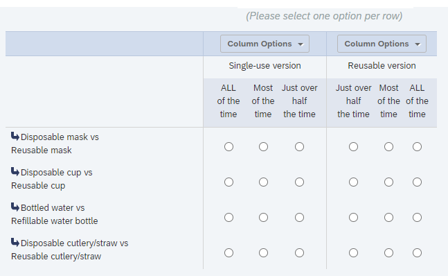
--------------------
For interest's sake, the other option that came close to working was a bi-polar scale, which used javascript to float the right-hand side labels. However I can't find a way to add display logic to the floating labels, which means that if logic prevents a particular row from showing, Qualtrics still displayed the floating label, in the next available row, so you couldn't tell what the correct label was.
Back-end of slider: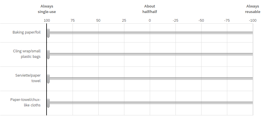 JS code to make floating right labels:
Front-end of slider - when all options selected: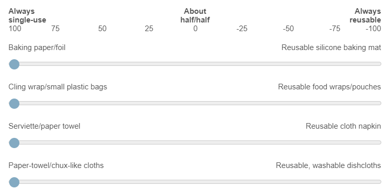
Front-end of slider when first option (baking paper/foil) not selected - labels are now out of sync: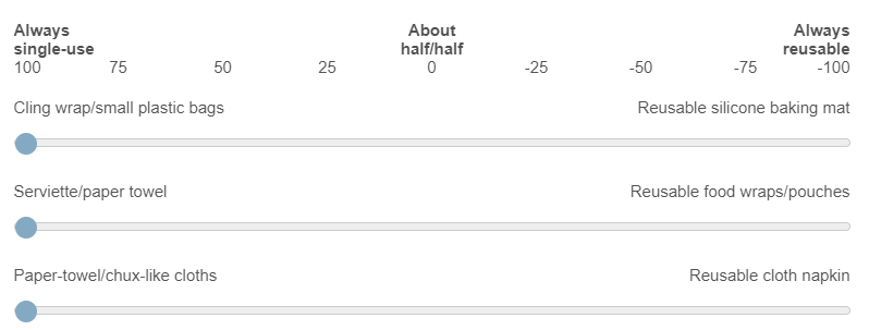
The same thing happens with bipolar matrix labels, and I also tried about 4 different ways of labelling a matrix to get the same effect as a side-by-side, similar to the below examples, but the weird spacing of the labels (even when I tried to adjust) just didn't work, and even when I floated 'Single-use' and 'Reusbale' over the top of 'Most of the time' middle options, the lack of a line between the two halves was still reported as being a problem in understanding the two ends of the scale.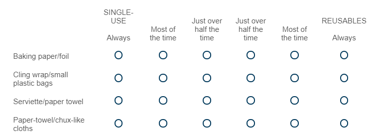
Force max 1 choice/row in side-by-side, OR unselect in side-by-side
Sign up
Already have an account? Login

Welcome! To join the Qualtrics Experience Community, log in with your existing Qualtrics credentials below.
Confirm your username, share a bit about yourself, Once your account has been approved by our admins then you're ready to explore and connect .
Free trial account? No problem. Log in with your trial credentials to join.
No free trial account? No problem! Register here
Already a member? Hi and welcome back! We're glad you're here 🙂
You will see the Qualtrics login page briefly before being taken to the Experience Community
Login with Qualtrics

Welcome! To join the Qualtrics Experience Community, log in with your existing Qualtrics credentials below.
Confirm your username, share a bit about yourself, Once your account has been approved by our admins then you're ready to explore and connect .
Free trial account? No problem. Log in with your trial credentials to join. No free trial account? No problem! Register here
Already a member? Hi and welcome back! We're glad you're here 🙂
You will see the Qualtrics login page briefly before being taken to the Experience Community
Login to the Community

Welcome! To join the Qualtrics Experience Community, log in with your existing Qualtrics credentials below.
Confirm your username, share a bit about yourself, Once your account has been approved by our admins then you're ready to explore and connect .
Free trial account? No problem. Log in with your trial credentials to join.
No free trial account? No problem! Register here
Already a member? Hi and welcome back! We're glad you're here 🙂
You will see the Qualtrics login page briefly before being taken to the Experience Community
Login with Qualtrics

Welcome! To join the Qualtrics Experience Community, log in with your existing Qualtrics credentials below.
Confirm your username, share a bit about yourself, Once your account has been approved by our admins then you're ready to explore and connect .
Free trial account? No problem. Log in with your trial credentials to join. No free trial account? No problem! Register here
Already a member? Hi and welcome back! We're glad you're here 🙂
You will see the Qualtrics login page briefly before being taken to the Experience Community
Enter your E-mail address. We'll send you an e-mail with instructions to reset your password.
