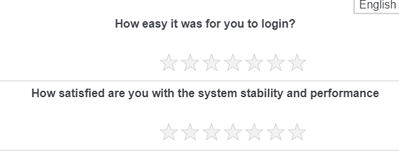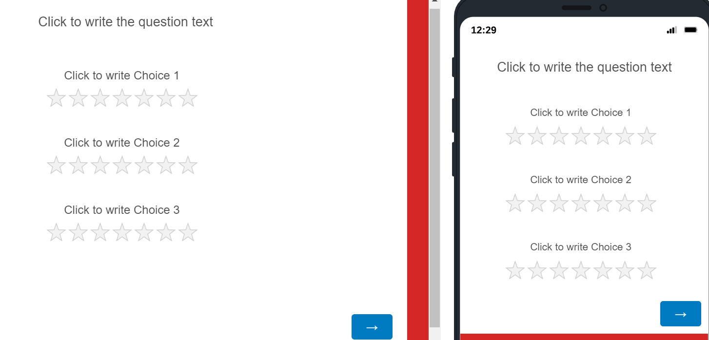
How do i align the stars in the center?

Best answer by Tom_1842
Hi there, if you still need, I was able to put this in place by adapting TomG's code in this post. It puts the stars on a row beneath the statements. I then added CSS to center the statements and stars.  First, create a slider question and change the type to "Stars". Set the number of statements to 3 and the number of stars to 7. Write in some question text and then use the Rich Content Editor to center the text.
Next, add the below to the question's JavaScript in the OnReady section
jQuery("#"+this.questionId+" tr").each(function() {
var row = jQuery(this);
var th = row.before("
row.prev("tr").append(th);
});
Finally, add the below CSS to the Style section of the survey's Look & Feel
.Skin .Slider .STAR .horizontalbar table.sliderGrid tr td.value {
display: none !important;
}
div.Inner.BorderColor.STAR > div > fieldset > div > div.horizontalbar.ChoiceStructure.Stars > table > thead > tr:nth-child(1) {
display: none !important;
}
.Skin .STAR .Stars tbody tr {
display: flex !important;
flex-wrap: wrap !important;
justify-content: center !important;
}
.Skin .STAR .StarsContainer {
left: -119px;
}
The 'left' bit in the last line will need to be adjusted depending on how many stars are there. -119 looks good for 7 stars and -85 looked good for 5.
Sign up
Already have an account? Login

Welcome! To join the Qualtrics Experience Community, log in with your existing Qualtrics credentials below.
Confirm your username, share a bit about yourself, Once your account has been approved by our admins then you're ready to explore and connect .
Free trial account? No problem. Log in with your trial credentials to join.
No free trial account? No problem! Register here
Already a member? Hi and welcome back! We're glad you're here 🙂
You will see the Qualtrics login page briefly before being taken to the Experience Community.
Login with Qualtrics

Welcome! To join the Qualtrics Experience Community, log in with your existing Qualtrics credentials below.
Confirm your username, share a bit about yourself, Once your account has been approved by our admins then you're ready to explore and connect .
Free trial account? No problem. Log in with your trial credentials to join. No free trial account? No problem! Register here
Already a member? Hi and welcome back! We're glad you're here 🙂
You will see the Qualtrics login page briefly before being taken to the Experience Community.
Login to the Community

Welcome! To join the Qualtrics Experience Community, log in with your existing Qualtrics credentials below.
Confirm your username, share a bit about yourself, Once your account has been approved by our admins then you're ready to explore and connect .
Free trial account? No problem. Log in with your trial credentials to join.
No free trial account? No problem! Register here
Already a member? Hi and welcome back! We're glad you're here 🙂
You will see the Qualtrics login page briefly before being taken to the Experience Community.
Login with Qualtrics

Welcome! To join the Qualtrics Experience Community, log in with your existing Qualtrics credentials below.
Confirm your username, share a bit about yourself, Once your account has been approved by our admins then you're ready to explore and connect .
Free trial account? No problem. Log in with your trial credentials to join. No free trial account? No problem! Register here
Already a member? Hi and welcome back! We're glad you're here 🙂
You will see the Qualtrics login page briefly before being taken to the Experience Community.
Enter your E-mail address. We'll send you an e-mail with instructions to reset your password.


