How to edit the text element which are added by javascripts for a text entry question | XM Community
Skip to main content

Dear all,

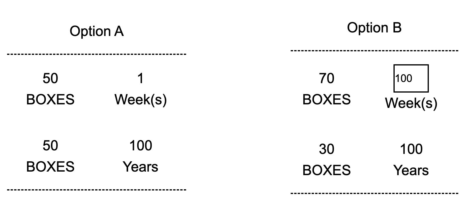
Currently I am trying to create my survey with a text-entry question. Specifically, I am trying to make it in the form of option-matching as shown below. 

Ideal Format

However, I can not achieve above format yet, and my best outcome so far is like below:

Current Format

For the current format, I firstly adjust the location of the text entry question’s legend by the CSS style code below so that I have a left-right layout, while the OPTION A content is the legend. 

#QID1 .InnerInner fieldset legend{
float:left;
width:55%;
}
#QID1 .InnerInner fieldset QuestionBody{
float:left;
width:45%;
}

Then, I add the text before and after the text entry box by:

Qualtrics.SurveyEngine.addOnload(function()
{
jQuery("#"+this.questionId+" .InputText").before("OPTION B");
jQuery("#"+this.questionId+" .InputText").after(" XXX");
this.questionContainer.select('.ChoiceStructure')t0].style = 'text-align: center;';
});

However, current display effect does not meet my needs. Could you please tell me how to improve it and achieve my desired effect?

In other words, it will be very appreciated if you can tell me how can I edit the text I add via the JS codes. For example, I tried to add a line break after the “OPTION B” by “OPTION B //n”, but it fails.

Thank you for your attention.

Regards,

Elon

This should do what you are aiming for: https://drive.proton.me/urls/117YG2KBEG#2uEnrzjyFKMJ


Demo here: https://iima.au1.qualtrics.com/jfe/preview/previewId/d9d3df54-84ce-4e9e-a451-7e115020eef1/SV_2ir2gQNkhBmGB4q?Q_CHL=preview&Q_SurveyVersionID=current


Hello AhmedA,

Firstly, I would like to extend my deepest gratitude for your insightful response, which presented an exceptionally clever solution. It closely aligns with what I was looking for, with one minor aspect requiring adjustment: the relative dimensions of the two options.

In your demonstration, Option B on the right exhibits greater width and height. As illustrated in the figure below, I attempted to align the widths by breaking the text lines within each option. However, this approach falls short of an ideal resolution. To equalize the heights, I adjusted the margin and padding of the input box, albeit unsuccessfully. While setting the padding to "0px 0px" effectively reduces the padding on the left and right sides of the input box, it fails to eliminate the spaces above and below the input.

Could you please take another look to determine if a feasible solution exists?

Thank you once more for dedicating your attention and time to this matter.

Best regards,
Elon


Leave a Reply