I've got some Matrix tables set in the carousal and horizontal format, but am having some difficulties getting them to look right.
Some of the text of the response points wraps, and they are wider than the screen, despite only taking up a small amount of the full width. It's fine on mobile view though. Another matrix has less options and it isn't having these issues.
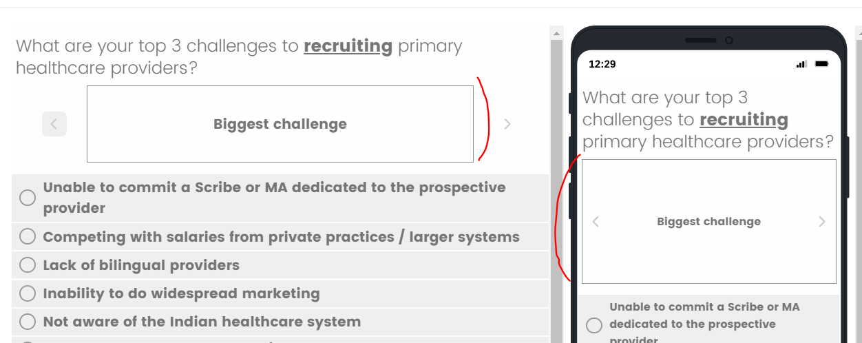
The question text is rather small considering the size of the carousal box. This is the case on both desktop and mobile view.
Are there any solutions that can make the response text use more of the screen and resize the text so they don't wrap halfway through a word?
And are there ways to make the question text larger inside the carousal?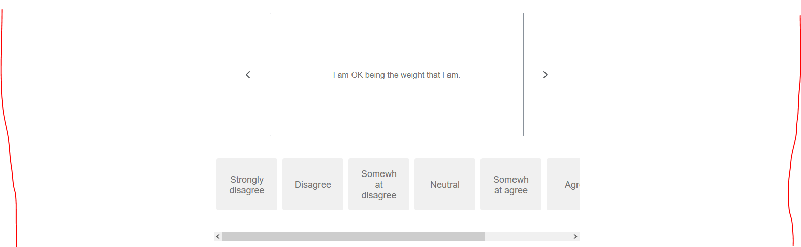 the other matrix responses not having the same issues
 Thanks!

Matrix Carousal Issues
 +1
+1Best answer by Tom_1842
Hi there, I found a thread that I think will be helpful to you:
https://community.qualtrics.com/XMcommunity/discussion/14820/modify-carousel-container-or-option-prompt-buttons
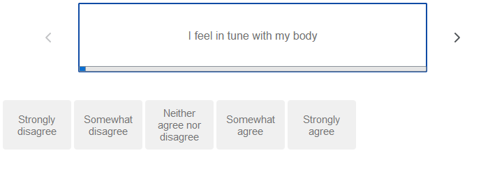
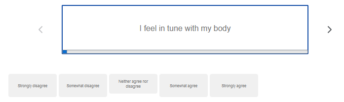
In that, Diana_A and SWhitfield provide some CSS that touches on what you're trying to do. I also went ahead and put their solutions together as well as added some lines so that it doesn't happen on mobile and the answer options have reduced padding. Reducing the font size of the Answer Text to around 14 also worked for me.
@media (min-width:480px) {
.CarouselAnswerButtonContainer {
min-width: 98px;
width: 60px;
padding-top: 0px;
padding-bottom: 0px;
padding-left: 0px;
padding-right: 0px;
margin: 2px;
}
.CarouselAnswerButton.Horizontal.Overflow { min-width: 15px;}
.CarouselCardFrame{position:relative;
width:500px;
margin:20px 0;
height:100px;
border:2px solid #104ba5;
border-radius:2px}
.Skin label.SingleAnswer {padding: 10px;}
}

Sign up
Already have an account? Login

Welcome! To join the Qualtrics Experience Community, log in with your existing Qualtrics credentials below.
Confirm your username, share a bit about yourself, then you're ready to explore and connect .
Free trial account? No problem. Log in with your trial credentials to join.
No free trial account? No problem! Register here
Already a member? Hi and welcome back! We're glad you're here 🙂
You will see the Qualtrics login page briefly before being taken to the Experience Community.
Login with Qualtrics
Welcome! To join the Qualtrics Experience Community, log in with your existing Qualtrics credentials below.
Confirm your username, share a bit about yourself, then you're ready to explore and connect .
Free trial account? No problem. Log in with your trial credentials to join. No free trial account? No problem! Register here
Already a member? Hi and welcome back! We're glad you're here 🙂
You will see the Qualtrics login page briefly before being taken to the Experience Community.
Login to the Community
Welcome! To join the Qualtrics Experience Community, log in with your existing Qualtrics credentials below.
Confirm your username, share a bit about yourself, then you're ready to explore and connect .
Free trial account? No problem. Log in with your trial credentials to join.
No free trial account? No problem! Register here
Already a member? Hi and welcome back! We're glad you're here 🙂
You will see the Qualtrics login page briefly before being taken to the Experience Community.
Login with Qualtrics
Welcome! To join the Qualtrics Experience Community, log in with your existing Qualtrics credentials below.
Confirm your username, share a bit about yourself, then you're ready to explore and connect .
Free trial account? No problem. Log in with your trial credentials to join. No free trial account? No problem! Register here
Already a member? Hi and welcome back! We're glad you're here 🙂
You will see the Qualtrics login page briefly before being taken to the Experience Community.
Enter your E-mail address. We'll send you an e-mail with instructions to reset your password.