Removing Horizontal Scroll Bar (Carousel Formatted Matrix) | XM Community
Skip to main content
Question

Removing Horizontal Scroll Bar (Carousel Formatted Matrix)

  • July 14, 2023
  • 3 replies
  • 1094 views

SashaM
Forum|alt.badge.img+2

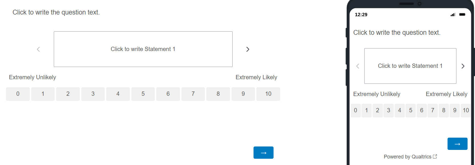
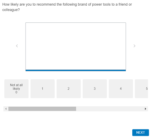
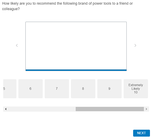
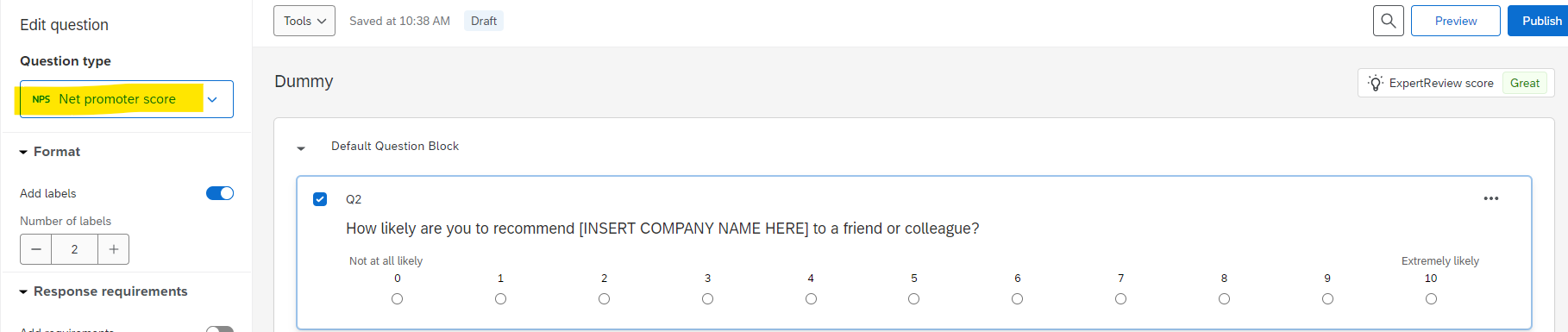
I have a survey that’s set up using the classic theme. One of the questions is a matrix question formatted to be displayed as a carousel with an 11-point horizontal scale. Is there any way to remove the horizontal scroll bar and have the entire scale displayed? 

I don’t have much experience with Qualtrics so the more detailed the instruction the better. Thank you so much in advance!


3 replies

Sachin Nandikol
QPN Level 6 ●●●●●●
Forum|alt.badge.img+44
  • QPN Level 6 ●●●●●●
  • 531 replies
  • July 14, 2023

Hi @SashaM,

I would suggest you to use ‘Net Promoter Score’ question type here. By that way you will not get any scrolling.

Below is the screenshot for your reference:


Let me know if this helps you.


SaurabhPujare_Ugam
QPN Level 5 ●●●●●
Forum|alt.badge.img+18
  • QPN Level 5 ●●●●●
  • 145 replies
  • July 14, 2023

Hi @SashaM ,

Nice to e-meet you.

The carousel format of matrix has very limited scope of customization, even if you have managed to fit the scales on desktop it may look congested on mobile screen.

Thus, I would recommend to show the rating scales in vertical format rather than horizontal OR you can use the transitional (i.e., row vs column) style matrix question.


best,

Saurabh


Tom_1842
Level 8 ●●●●●●●●
Forum|alt.badge.img+28
  • Level 8 ●●●●●●●●
  • 909 replies
  • July 16, 2023

I was able to put together some CSS that I think makes the Matrix Carousel look okay for 11pt scale. To give it a try, set the survey to Classic and create a Matrix question. Set it to Carousel with Horizontal alignment and give it 11 scale points labeled 0-10. Enable the ‘Add labels’ toggle, set it to 2, and write in “Extremely Unlikely” and “Extremely Likely”. Disable the “Mobile Friendly” toggle. Then, add the below CSS to the Style section of the survey’s Look & Feel:

.CarouselAnswerButtonContainer {
min-width: 0px !important;
padding-top: 0px !important;
padding-bottom: 0px !important;
padding-left: 0px !important;
padding-right: 0px !important;
}

.CarouselAnswerButton.Horizontal.Overflow {
min-width: 15px !important;
}

.CarouselAnswerContainer {
margin: 0px !important;
min-width: 100% !important;
}

.CarouselHorizontalAnswerWrapper.Overflow {
width: inherit !important;
}

.CarouselCardFrame{
position:relative !important;
margin:20px 0 !important;
height:100px !important;
}

@media (min-width:480px) {

.CarouselAnswerButtonContainer {
margin: 2px !important;
}

.Skin label.SingleAnswer {
padding: 10px !important;
}

}

@media (max-width:479px) {

.CarouselAnswerButtonContainer {
margin: 1px !important;
white-space: nowrap !important;
}

.Skin label.SingleAnswer {
margin-left: 1px !important;
margin-right: 1px !important;
}

}