
On a CX dashboard widget, is it possible to show how many responses fall within a range? So out of 100 points, how many fall between 90-100, 80-89.9, etc? Ideally, the ranges would be rows, rather than a filter on the entire widget.
Additionally, I need to average the scores gained from individual respondents, and roll those up to the ranges above. I started to use a custom metric for this, but got stuck once I couldn't use it to filter. (This step is why I don't think embedded data will work for the first step)
As background, I've been able to do this in Data Studio, but I used CASE logic to create the ranges. I'm trying to figure out if you can achieve something similar in Qualtrics or not.
Any help is appreciated!

Solved
Show number of responses that fit within a range
Best answer by InessaG
You can create a custom field (bucketing or formula) in your survey's Data & Analysis tab, and then map it into your dashboard. That should then give you the desired behavior, I believe.


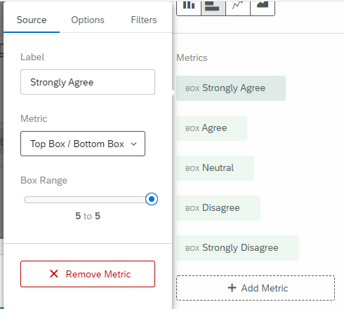 The widget looks like this:
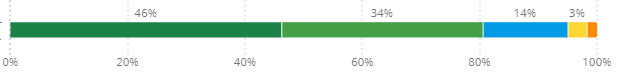 Maybe this is what you are looking for.
 Sign up
Already have an account? Login

Welcome! To join the Qualtrics Experience Community, log in with your existing Qualtrics credentials below.
Confirm your username, share a bit about yourself, then you're ready to explore and connect .
Free trial account? No problem. Log in with your trial credentials to join.
No free trial account? No problem! Register here
Already a member? Hi and welcome back! We're glad you're here 🙂
You will see the Qualtrics login page briefly before being taken to the Experience Community.
Login with Qualtrics
Welcome! To join the Qualtrics Experience Community, log in with your existing Qualtrics credentials below.
Confirm your username, share a bit about yourself, then you're ready to explore and connect .
Free trial account? No problem. Log in with your trial credentials to join. No free trial account? No problem! Register here
Already a member? Hi and welcome back! We're glad you're here 🙂
You will see the Qualtrics login page briefly before being taken to the Experience Community.
Login to the Community
Welcome! To join the Qualtrics Experience Community, log in with your existing Qualtrics credentials below.
Confirm your username, share a bit about yourself, then you're ready to explore and connect .
Free trial account? No problem. Log in with your trial credentials to join.
No free trial account? No problem! Register here
Already a member? Hi and welcome back! We're glad you're here 🙂
You will see the Qualtrics login page briefly before being taken to the Experience Community.
Login with Qualtrics
Welcome! To join the Qualtrics Experience Community, log in with your existing Qualtrics credentials below.
Confirm your username, share a bit about yourself, then you're ready to explore and connect .
Free trial account? No problem. Log in with your trial credentials to join. No free trial account? No problem! Register here
Already a member? Hi and welcome back! We're glad you're here 🙂
You will see the Qualtrics login page briefly before being taken to the Experience Community.
Enter your E-mail address. We'll send you an e-mail with instructions to reset your password.