Hi, I have a question about the field grouping addition in the Qualtrics data set. When I go to add a field group, I added this under the data source.
When I add a new widget, say a horizontal bar graph, and then go to add the x-axis, how do I add the field group of measures to the bar chart? Is it supposed to appear in the metrics?
Best answer by Sachin Nandikol
Hello @four77,
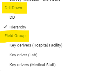
It essentially depends on the field group you've added. For instance, if you've added a 'Measure Group,' it will appear under 'Field Group' during mapping. Similarly, if you've added a 'Drill Down,' it will be under 'Drill Down' in your mapping settings. You can also use the search bar to quickly find your field if you have a large number of fields mapped. Please refer to the screenshot below for clarity:
It essentially depends on the field group you've added. For instance, if you've added a 'Measure Group,' it will appear under 'Field Group' during mapping. Similarly, if you've added a 'Drill Down,' it will be under 'Drill Down' in your mapping settings. You can also use the search bar to quickly find your field if you have a large number of fields mapped. Please refer to the screenshot below for clarity: