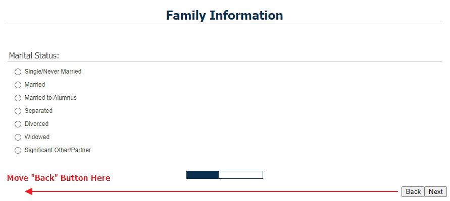
Hello,
I was wondering if there was a way to separate the forward and backward buttons so they are not right next to each other at the bottom of a block. For example, I don't want the respondent to misclick accidently submit the survey incase they wanted to go back and change some responses.
Perhaps this can be done in the html editor? If this can be edited in JS (javascript), I looked around in the 'Qualtrics JavaScript Question API Class'. I only see hideNextButton, hidePreviousButton ,showNextButton, and showPreviousButton. Although I'm sure the JS functions only go question by question, I thought I'd look there for more info anyway since the best bet to call those buttons with jquery.
Maybe there is something simple I'm overlooking, but I figured I'd ask.
Thank you!
Solved
Forward and Backward buttons on separate ends of block
Best answer by ahmedA
By default they're not supposed to be together. The back is usually at the place where you want it to be. Someone's been messing around with your theme. I would recommend checking with your brand admin if this is a conscious descision.
Meanwhile, add this to your header:


