Hi, thanks in advance for your time! As part of a larger Qualtrics-based intervention, I have a survey that users will fill out every day for 16 weeks. The survey has only two questions:
- What is your current mood? (1-10)
- Did you practice your goal today? (yes / no / not yet)
After they submit the survey, I want to redirect them to some data visualization so they can view their progress over time:
- (1) a line graph showing their mood over time (date submitted on X-axis, mood on Y-axis)
- (2) a bar graph showing the frequencies at which they selected yes / no / not yet
I have tried to accomplish this goal a few ways:
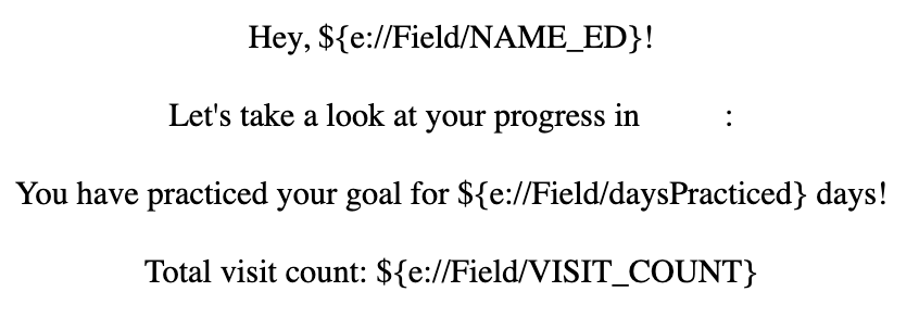
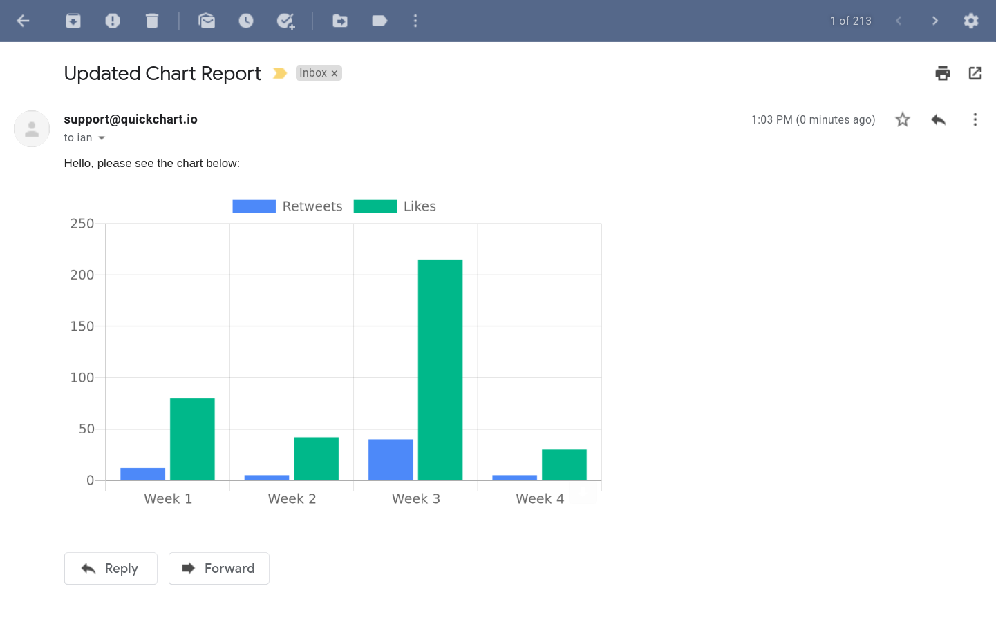
- Message: At survey submission, redirect them to a library message that pipes in some data associated with their GUID. However, I can’t figure out how to build out graphs here.
-
- Reports: I can direct individuals to a Qualtrics report with some interesting graphs at the end of the survey. Yet I can’t figure out how to customize that report for each person. i.e., all individuals log into and fill out the same survey, so I would need the report to filter the data they’re shown by their GUID. Currently, I can only figure out how to redirect them to a public report link, which would show them everyone’s data, which doesn’t address my goal of providing some personalized data viz.
Am I missing a better approach? Is there a way to make the report filtering or something else work? Any help would be much appreciated. Thank you!!


