Force Table in Mobile View | XM Community
Skip to main content
Solved

Force Table in Mobile View

  • December 28, 2023
  • 6 replies
  • 173 views

Forum|alt.badge.img+1

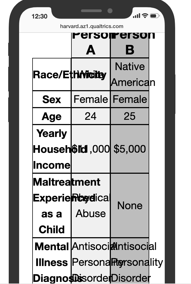
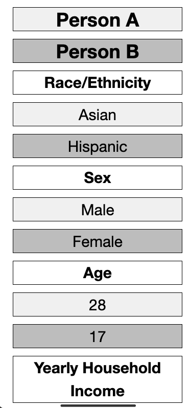
For my survey, I display tables to the respondent. In desktop view they look great, but in mobile view they automatically re-align so that the table becomes a single column. I want to force the table to remain as such on mobile view, even if that would require the respondent to scroll if necessary to see everything. How could I do that? Below Please find an example of what the table looks like on a desktop vs mobile device. Thanks so much for your help!


Best answer by TomG

Smith wrote:

Hi @TomG, unfortunately I do not know how to do that, but here is the preview that contains my question. Thanks so much for your help!

Add a class to your table element. For example:

<table class="abTable" ...etc...

Add a media rule using the class to override the current media rule:

@media (max-width: 480px) {
  .Skin .MC .SAHR .abTable td { display: table-cell; }
}


View original

6 replies

vgayraud
QPN Level 5 ●●●●●
Forum|alt.badge.img+47
  • QPN Level 5 ●●●●●
  • 327 replies
  • December 29, 2023

Hi @Smith ,

It’s hard to help you without seeing your table code, but you probably used a tool that designs responsive tables. Regular html tables are not responsive.


TomG
Level 8 ●●●●●●●●
Forum|alt.badge.img+27
  • Level 8 ●●●●●●●●
  • 5860 replies
  • December 29, 2023

@Smith,

I’m guessing you have a CSS media rule that is applying a display:block style to <td> elements on mobile. If so, you’ll need to add a CSS rule to override that rule. 

If you don’t know how to do that, post a public block preview of a block that contains the question with your table.


Forum|alt.badge.img+1
  • Author
  • 2 replies
  • December 29, 2023

Hi @TomG, unfortunately I do not know how to do that, but here is the preview that contains my question. Thanks so much for your help!


TomG
Level 8 ●●●●●●●●
Forum|alt.badge.img+27
  • Level 8 ●●●●●●●●
  • 5860 replies
  • Answer
  • December 29, 2023
Smith wrote:

Hi @TomG, unfortunately I do not know how to do that, but here is the preview that contains my question. Thanks so much for your help!

Add a class to your table element. For example:

<table class="abTable" ...etc...

Add a media rule using the class to override the current media rule:

@media (max-width: 480px) {
  .Skin .MC .SAHR .abTable td { display: table-cell; }
}


Forum|alt.badge.img+1
  • Author
  • 2 replies
  • December 29, 2023

@TomG that works great, only now the text spills over into other boxes. I assume there is a relatively easy fix for that too. I do not know the CSS for it offhand, so if you know what would fix it let me know, otherwise I will play around with it. Thanks again for your help!


TomG
Level 8 ●●●●●●●●
Forum|alt.badge.img+27
  • Level 8 ●●●●●●●●
  • 5860 replies
  • December 29, 2023

@Smith,

Use the same media rule to reduce the font-size.  You’ll still probably need some words to break. Use &ZeroWidthSpace; after Race/ and &shy; between syllables of other long words.


Leave a Reply