
Hello everyone,
I'm implementing a dashboard for an Ad Hoc Employee Reaserch survey.
I would like to show the response rate of the survey based on an embedded data set in the survey flow. I've tried using the response rate widget but as I reckon you can only use it with metadata fields. Is there something I'm missing?
Moreover, regarding the Question list widget, I would like to sort the questions by distribution using the negative percentage. Is there any way I could use that instead of the positive one?
Thank you in advance

Solved
EX Dashboard - Widget Response Rate and Question list
Best answer by TimR
The Response Rates widget is inextricably tied to the Participants List on account of the Invited count. The Respondents in your Participants List become the Invited count (Multiple Responses excepted, i.e. the Invited count can update each time a Respondent becomes eligible to respond again, e.g. you could have 10 Respondents but an Invited count of 20).
Since the Invited count is a core component of the Response Rates widget, any applied filters must be able to apply to the Participants. Metadata and hierarchy information are directly linked to the Participants. However, embedded data lives ON the response and is not directly linked to a participant. That is why embedded data cannot be used to filter a Response Rates widget, as it cannot filter the Invited count.
As for the Question List widget, I don't think there's an option to sort the questions by unfavorable percentage.
I take it you're trying to draw out the worst scoring items by way of most unfavorable as opposed to least favorable, but I think least favorable is the closest you get with the Question List widget.
The way I'd achieve this most clearly is to configure my Question List widget as follows:
- 0 (zero) "# of High Statements to Show"
- Turn off the "Descending" option for "Default Sort By Order"
- Put in an "Optional Low Statements Header" with something like "Low Scoring Items"
- Disable column sorting
- Show all percents
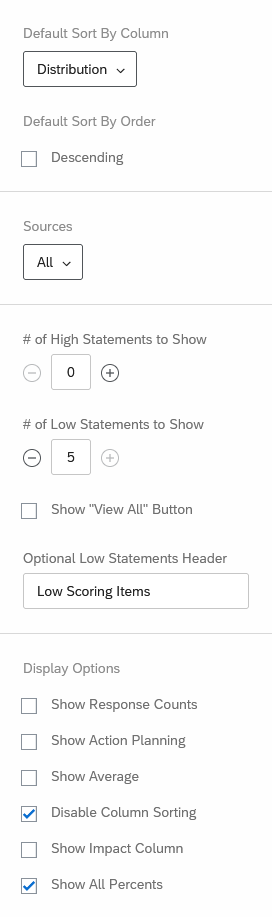 You may select other options to suit your needs, but these would be the vital pieces I'd use to get close to what I think you're going for.
Now, if you're willing to give up limiting the number of items shown, you can create a Simple Chart widget that allows you to sort with a descending order on the unfavorable percentage. You could size the widget so it only shows 3 or 5 of those, but a dashboard user could technically scroll down in the widget to view all items sorted in descending unfavorable percentage.
Since a Question List widget has favorability distributions automatically by way of the dashboard's Scales, a Simple Chart requires a bit more setup. On a Simple Chart widget, you mimic the favorability distribution using three separate Top Box/Bottom Box metrics. Before this, though, you need to create a Category that contains all the questions you'd like to be eligible for showing up.
When setting up the Simple Chart widget, you'll set up your three Top/Bottom Box metrics, selecting the All Items category you created, and setting the Label and Box Range for each metric (Favorable gets 4-5, Neutral gets 3, and Unfavorable gets 1-2, depending on your recode values). When you create more than one metric, "Metrics" automatically become the "X-Axis" dimension. Go down to the "Data Series" section, click "Set Data Series", and select your All Items category. Then hit the shuffle button that sits between the "X-Axis" selection and the "Data Series" - you'll see the effect on the bars of the Simple Chart widget as it groups everything by item within the category instead of by metric. The last piece to get them looking like a favorability distribution is to enable the "Stack Chart" option near the bottom of the configuration pane.
To get it sorted in your desired fashion, change the Axis Sorting to your "Unfavorable" metric, and toggle the ascending/descending arrow to put it in descending order. You now have a Simple Chart widget sorting all eligible items in descending order from most unfavorable to least unfavorable. A few other options might be altered to improve quality of life, like changing the Chart Type from vertical bars to horizontal bars, enabling "Show data values", and adjusting bar color under the Legend Values.
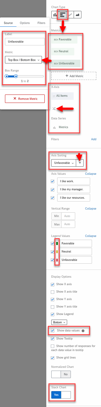 Though you can hide items under the Axis Values section by unchecking their box, remember that any item might be the most unfavorable item for a given dashboard user's slice of data, so avoid the notion to hide some of those simply because they aren't the most unfavorable items in your unrestricted data view.

Sign up
Already have an account? Login

Welcome! To join the Qualtrics Experience Community, log in with your existing Qualtrics credentials below.
Confirm your username, share a bit about yourself, then you're ready to explore and connect .
Free trial account? No problem. Log in with your trial credentials to join.
No free trial account? No problem! Register here
Already a member? Hi and welcome back! We're glad you're here 🙂
You will see the Qualtrics login page briefly before being taken to the Experience Community.
Login with Qualtrics
Welcome! To join the Qualtrics Experience Community, log in with your existing Qualtrics credentials below.
Confirm your username, share a bit about yourself, then you're ready to explore and connect .
Free trial account? No problem. Log in with your trial credentials to join. No free trial account? No problem! Register here
Already a member? Hi and welcome back! We're glad you're here 🙂
You will see the Qualtrics login page briefly before being taken to the Experience Community.
Login to the Community
No account yet? Create an account
Welcome! To join the Qualtrics Experience Community, log in with your existing Qualtrics credentials below.
Confirm your username, share a bit about yourself, then you're ready to explore and connect .
Free trial account? No problem. Log in with your trial credentials to join.
No free trial account? No problem! Register here
Already a member? Hi and welcome back! We're glad you're here 🙂
You will see the Qualtrics login page briefly before being taken to the Experience Community.
Login with Qualtrics
Welcome! To join the Qualtrics Experience Community, log in with your existing Qualtrics credentials below.
Confirm your username, share a bit about yourself, then you're ready to explore and connect .
Free trial account? No problem. Log in with your trial credentials to join. No free trial account? No problem! Register here
Already a member? Hi and welcome back! We're glad you're here 🙂
You will see the Qualtrics login page briefly before being taken to the Experience Community.
Enter your E-mail address. We'll send you an e-mail with instructions to reset your password.