We have an onboarding survey sent to every new office employee across our organization for which we have built a dashboard. We currently have a participation rate table by country which gives us data on how many people were invited and how many people responded.
I would like to filter that information by time periods (e.g. from Jan 1st to March 31st) so we can follow up on our hirings. However, I’ve noticed that data was not showing and read that time filtering was unavailable for participation rate table.
Is there a workaround for this? I feel the data is so close to get, I would appreciate any recommendations on what I could do to have the information we need.
Page 1 / 1
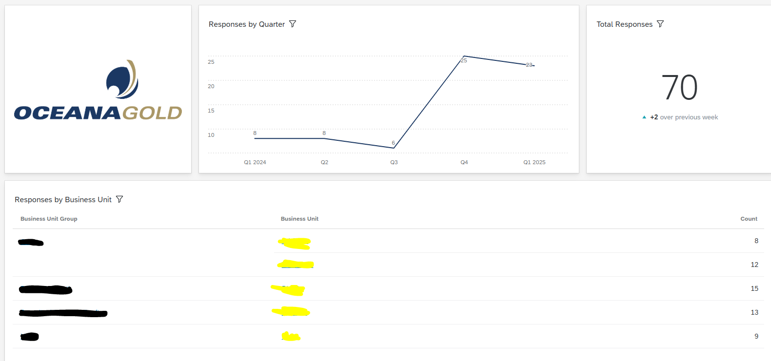
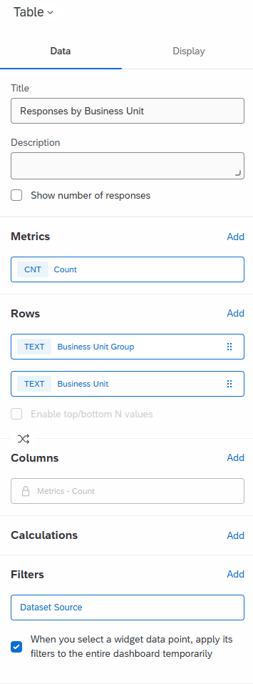
This is what I have set up for our Onboarding survey. I have a specific Responses Summary page, including responses by Business Unit (this is a table, which includes the settings I’ve included right at the bottom of this reply), you can see in the settings of this table I’ve selected the option “When you select a widget data point, apply its filters to the entire dashboard temporarily”, so when I select a location from the yellow field, it applies to all graphs on this page, including the response rate table, and the responses by quarter at the top.
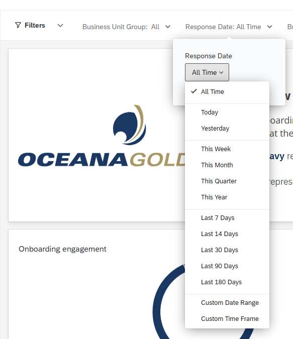
To add to my response above, as I left out one crucial piece of detail: we have a “response date” filter at the top. Ensure you have the correct date range applied, then use your table to additionally filter responses by location. If there aren’t enough responses to view, you could change your anonymity /sentitivty thresholds to show responses with fewer data points.
Hi EmmaOGC,
Thank you for your reply. I feel like you are referring to a screenshot, but I don’t see one.
This is what I have set up for our Onboarding survey. I have a specific Responses Summary page, including responses by Business Unit (this is a table, which includes the settings I’ve included right at the bottom of this reply), you can see in the settings of this table I’ve selected the option “When you select a widget data point, apply its filters to the entire dashboard temporarily”, so when I select a location from the yellow field, it applies to all graphs on this page, including the response rate table, and the responses by quarter at the top.
Is there a way to show me the graph?
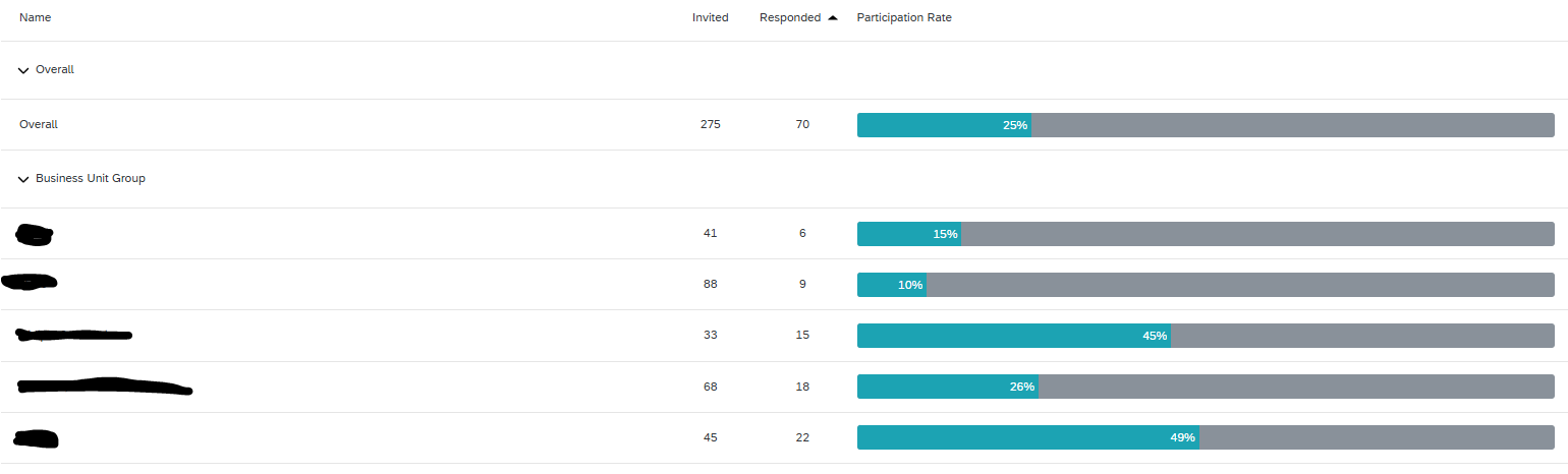
Great tip for the Response Date filter. However, as soon as I apply the filter, it doesn’t show data. This is a Response Rate Table. I tried with a table, and I can see respondents per country. Is there anyway to see how many people were invited to the survey, rather than only those who answered?
Thank you for your help!
Hi @MathieuBeaudoinBRP I’m not sure why the screenshots aren’t appearing for you, I can attempt to direct message if you like? And yes, my graphs show complete and incomplete as a %
Hello again Emma,
The problem I’m having is that only the response rate table seems to give the number of invited people, and that this widget cannot be filtered by dates. I tried using filters such as the Hire Date metadata, the Response date and Hire Quarter with no luck.
How are you able to use a date filter for the response rate table? If you’re not doing that, how are you able to see how many people were invited by quarters?
Thanks,
I have the same problem. The response rate table works as such, as long as my page does not have any filters.
As soon as I add any filter, being either on response date, or on an employee metadata field, the widget immediately shows the message “An unexpected error has occurred” and shows no data.
All other types of widgets (a.o. a widget that shows #responses per month) do work correctly and apply the page filters.
It are only the “participation summary” and “response rate table” widgets that are giving trouble when applying filters
Hi @MathieuBeaudoinBRP ,
Instead of using the default response rate table, you can manually recreate a similar metric using:
I think that’s it! What a wonderful feature, thank you for sharing this with me.
Have a wonderful day!
Hi @Nanditha MM (and @MathieuBeaudoinBRP fyi),
unfortunately, Custom Metrics are only available on CX Dashboards,
they are not available on EX Lifecycle project dashboards.
Hi @MathieuBeaudoinBRP ,
Always happy to share.
Wishing you a great day ahead too!
Best regards, Nanditha
Hi @JoycaV, If you're able to pass the invite date into the survey (as embedded data), you can enable filtering on that field within the dashboard. This gives you a way to see participation trends by time range and geography in EX dashboard