Hello, everyone!
I’m struggling to ensure that my videos display well for all participants regardless of the device they are using to complete the survey. I’m talking about smartphones, tablets, and laptops/desktops.
I’ve embedded YouTube videos using the HTML code from YouTube.
When the HTML code used a height of 315 and a width of 560, the videos were only partially displayed on my smartphone’s screen (Samsung A71).
I found a suggestion here https://community.qualtrics.com/custom-code-12/resize-videos-to-fit-screen-24737 to change the width in the HTML code to “100%” and the height to “auto.”
After that change, the videos started fitting on my Samsung phone screen, though the useful area of the video, the one with the picture showing information, became a bit smaller.
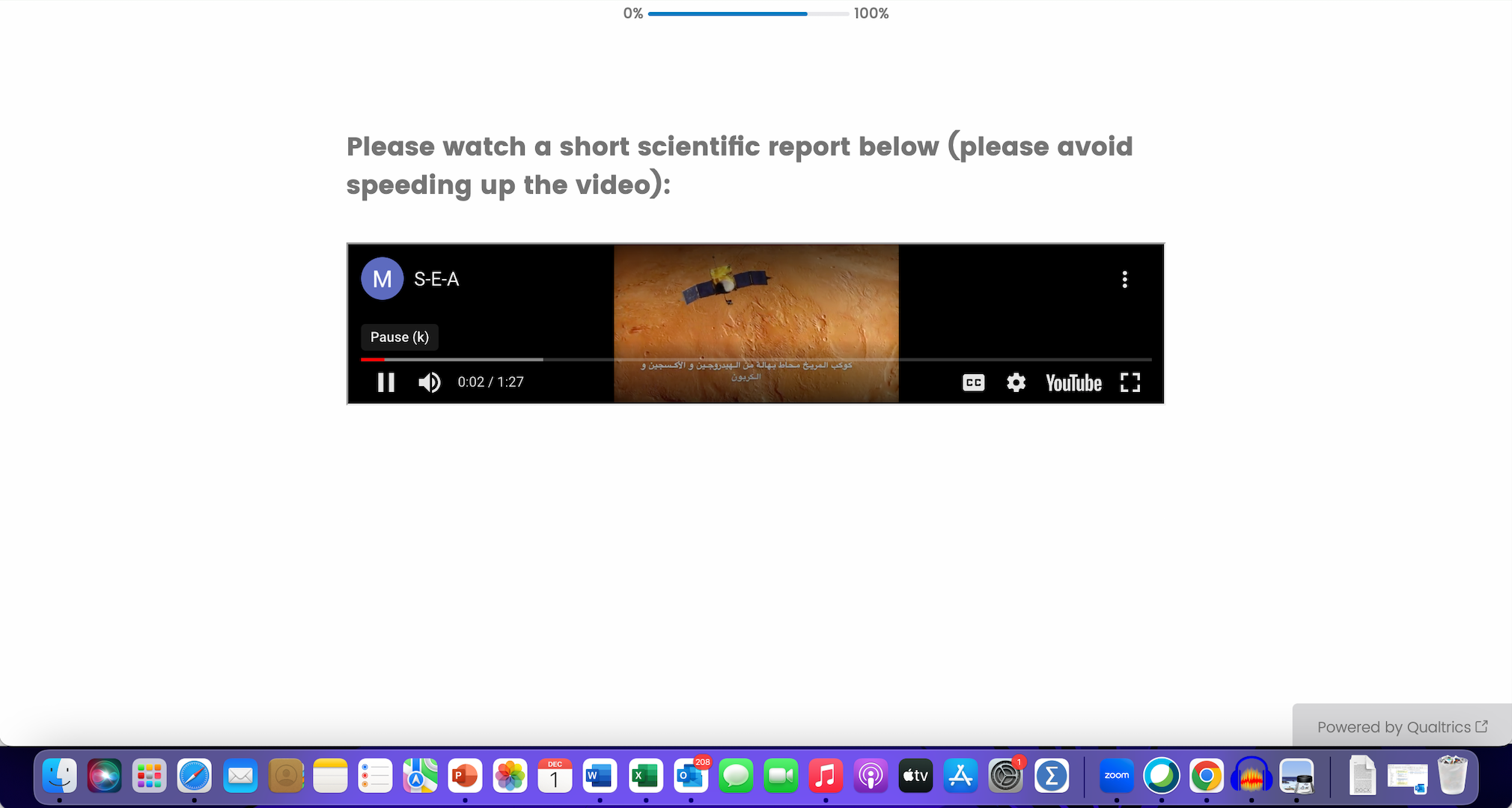
At the same time, the computer version of the video became long and narrow, and the video itself occupies a very small part of the screen while about two-thirds of the area is black space:

My question is:
Is there any HTML code I could use to fix the issue of the reduced size of the video picture?
P.S. I’m a rookie at coding.


