I have two questions regarding how the matrix table looks….
The first one is regarding Matrix questions with profile format. My current questionnaire (with green background) is showing the scales as giant buttons… which I don’t prefer. When I used this format before, I recalled it was a small circle (see the question with the library background). How can I change the look of the profile matrix table to the latter appearance?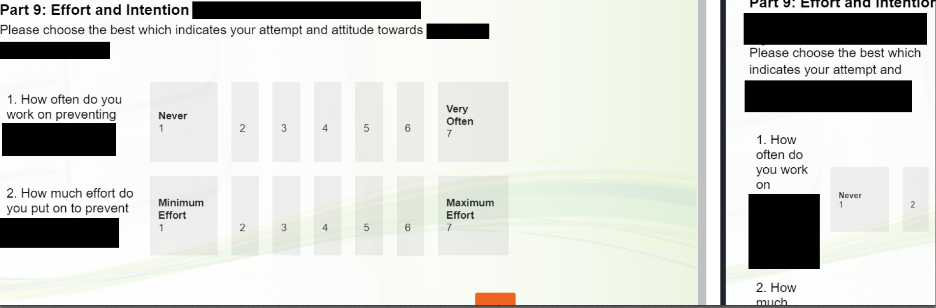
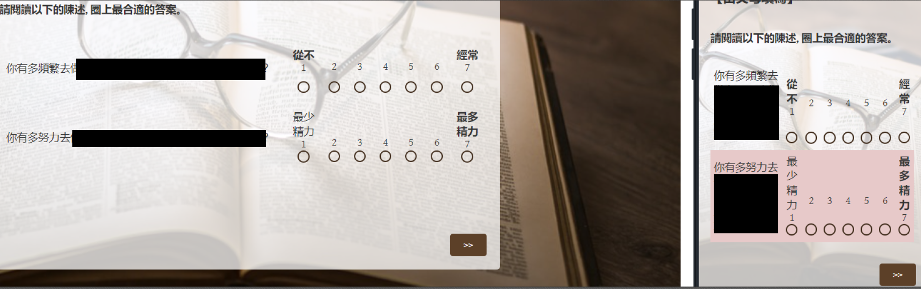
The second one is regarding how these matrix tables look in the mobile view. Currently, if I use the mobile-friendly function, all the questions will be piled up and dropped down as the participants go through them (image with green background). If I don’t use the mobile-friendly function, the matrix table is too large to fit in and the participants will need to scroll to get to the scale. Is it possible to make the matrix fit within the mobile display (see the image with the library background).
I am suspecting these differences may be related to the theme of the survey, however, the theme I am using now is required for my institute so I wouldn’t want to change it. Is there any way to fix the above questions without changing the theme too?
Thank you very much. 🙇♀️

Modify how matrix table looks
 +1
+1
Sign up
Already have an account? Login

Welcome! To join the Qualtrics Experience Community, log in with your existing Qualtrics credentials below.
Confirm your username, share a bit about yourself, then you're ready to explore and connect .
Free trial account? No problem. Log in with your trial credentials to join.
No free trial account? No problem! Register here
Already a member? Hi and welcome back! We're glad you're here 🙂
You will see the Qualtrics login page briefly before being taken to the Experience Community.
Login with Qualtrics
Welcome! To join the Qualtrics Experience Community, log in with your existing Qualtrics credentials below.
Confirm your username, share a bit about yourself, then you're ready to explore and connect .
Free trial account? No problem. Log in with your trial credentials to join. No free trial account? No problem! Register here
Already a member? Hi and welcome back! We're glad you're here 🙂
You will see the Qualtrics login page briefly before being taken to the Experience Community.
Login to the Community
No account yet? Create an account
Welcome! To join the Qualtrics Experience Community, log in with your existing Qualtrics credentials below.
Confirm your username, share a bit about yourself, then you're ready to explore and connect .
Free trial account? No problem. Log in with your trial credentials to join.
No free trial account? No problem! Register here
Already a member? Hi and welcome back! We're glad you're here 🙂
You will see the Qualtrics login page briefly before being taken to the Experience Community.
Login with Qualtrics
Welcome! To join the Qualtrics Experience Community, log in with your existing Qualtrics credentials below.
Confirm your username, share a bit about yourself, then you're ready to explore and connect .
Free trial account? No problem. Log in with your trial credentials to join. No free trial account? No problem! Register here
Already a member? Hi and welcome back! We're glad you're here 🙂
You will see the Qualtrics login page briefly before being taken to the Experience Community.
Enter your E-mail address. We'll send you an e-mail with instructions to reset your password.