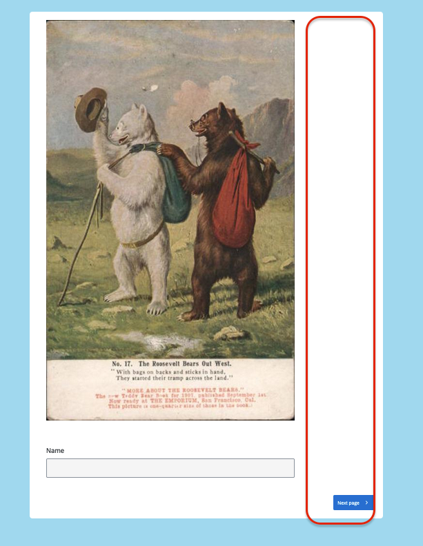
In Simple Layout, the navigation buttons are aligned to the far right of the screen, with padding added to push the “next button” far beyond the edge of questions. This design makes centering images, e.g. a logo, impossible. (In the attached screen shot, the html to resize the graphic is being ignored, but that’s a separate issue.)
My end-goal is to remove the additional right-padding and have the navigation button align to the right, or centered.
I have seen the code from user @tom_1842, but it does not seem to impact Simple Layout; various code snippets for moving the navigation buttons also seem to fail on Simple Layout.
In short, is there a way to change padding (or make the container 100% width), and a way to move the nav buttons? (I’ve looked for a Simple Layout CSS guide, but have come up empty)
Screen shot example
Best answer by Tom_1842
Hi, the below CSS should make the container 100% for Simple layout. I've also left in the lines that center the navigation buttons and added a couple that will center images.
If you're using the Simple Layout, making changes to its look and feel can be a bit challenging compared to other layouts. To center the buttons, you can use the following custom CSS code: #navigation { justify-content: center !important; }
Please try this code and let me know if it works for you. If you encounter any issues or if possible, please share the survey link with us so that we can inspect it and provide further assistance.
Thanks for the suggestion; that did indeed center the navigation button within the question container.
Do you have any leads on how to either remove the right padding, or force questions to span the entire container width?
@rbjak The simple layout doesn’t use .Skin or .SkinInner config, therefore your css is having no effect.
Please try this JS to center your image.
Qualtrics.SurveyEngine.addOnReady(function() {const quest = this;
const qid = quest.questionId;
const qc = quest.getQuestionContainer();
const questionHolder = qc.querySelector("#question-display-" + qid);
// These two lines will center your image
questionHolder.style.marginLeft = "auto";
questionHolder.style.marginRight = "auto";
// These two lines will expand the image to cover the entire container.
questionHolder.style.width = "100%";
questionHolder.style.maxWidth = "100%";
});
Hi, the below CSS should make the container 100% for Simple layout. I've also left in the lines that center the navigation buttons and added a couple that will center images.
@Tom_1842 That’s impressive, and worked exactly as I wanted. Thank you very much. Did you have to piece together the pieces, or is there a published CSS guide you used?
Glad to hear! I created a Simple layout survey and filled it up with a bunch of question types. Then I previewed the survey and used my browser's Developer Tools/Inspect Element (F12) to see which CSS rules were in place that were affecting the width of the elements, and I created new rules where the width/max-width for these elements are set to 100%.
Hi, the below CSS should make the container 100% for Simple layout. I've also left in the lines that center the navigation buttons and added a couple that will center images.
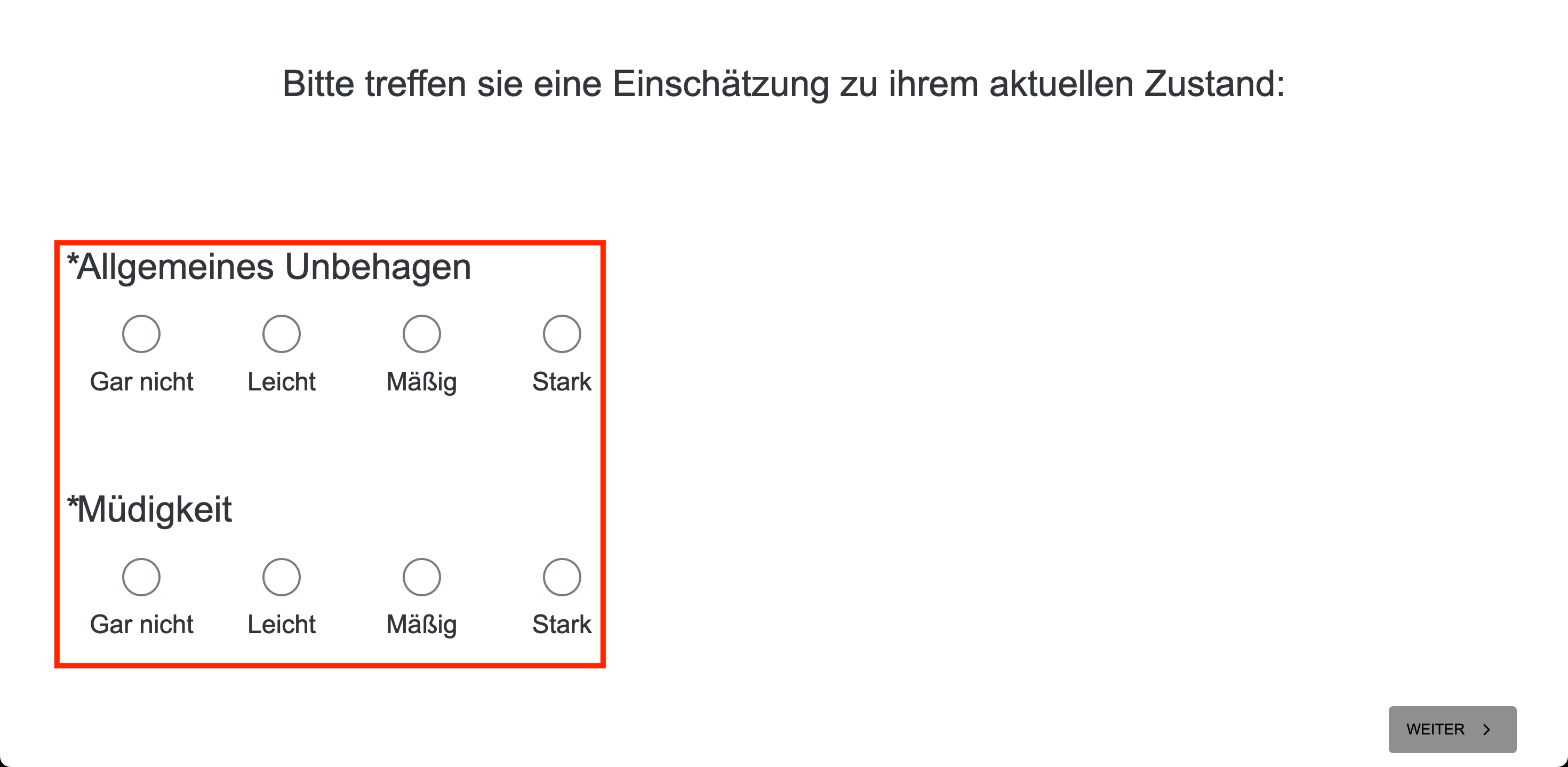
Hi! This was enormously helpful for my survey, too, but I have a follow up question: is there any possibility to center the answer options so that they’d be alligned with the top statement (see image below for clarification)?
And related to that same question type: is it possible to reposition the choices so that they’re further appart?


