I created a survey which includes loop and merge to enable up to 10 sets of survey responses. This is part of a site-level assessment that includes teacher feedback and up to 10 teachers can provide feedback on one site-level assessment. The loop and merge function was used to enable the data enterer to enter all of their data for one site into one survey response.
However, I am now building out a template report and finding it difficult to aggregate the loop and merge data into one visualization. Each template report is filtered to include just one site's worth of information, but as I said, up to 10 sets of survey responses. I have 5 questions in each set. I want to be able display a visualization that aggregates all 10 of the responses for question 1, all 10 of the responses for question 2, etc.
I am not able to determine a way to do this and Qualtrics customer support is no help. The only way I can imagine doing this is to create a new variable in which I sum all 10 responses for each of those 5 questions. I am just hoping that there is a more efficient way to do this.
Any suggestions or guidance would be appreciated!
Thanks!
I am trying to set up the data structure for a survey using loop & merge (before launching, to be safe) and experimenting with the different ways to present results.

Is there an easier way to create report or dashboard so that it shows information from all loops answers but also the aggregation from other respondents/surveys loops?
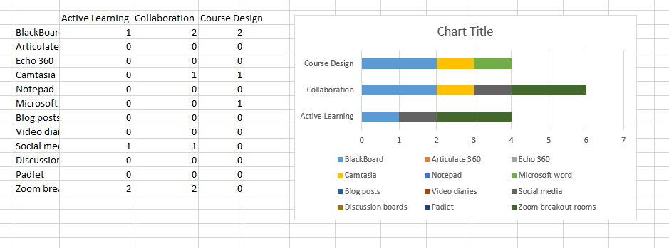
PeeyushBansal I'm having the same problem. How do I set up the question to create the stacked bar chart? I've worked out I need to transform the column in the excel and I've managed to import the data using a sliding bar type question to meet the number format requirements. I have no idea how to get the categories (blackboard, camtasia etc) into the visualisation though. Any help would be much appreciated
Any new feature now ? We are having the same problem here. Any easier ways than uploading all the results ?
Only way is to stack the data and then uploading this stacked data in some survey and using this survey to prepare aggregate visualiztions.
Hi everyone,
is there any update on this issue? are there new functionalities to solve the problem?
Best,
CM
Enter your E-mail address. We'll send you an e-mail with instructions to reset your password.
