
Solved
Simple customization of bar graphs
Hello Community,
I'm having a hard time doing what I think should be rather simple. I have figured out how to create a bucketing variable for my percentiles, and now I simply want to generate bar graphs to show these calculated percentiles on a per-respondent basis. I've already been told that data analysis is meant to approach things from an aggregate rather than individual reporting level. I can get around this by using filters; however, the capabilities of even a simple bar graph appear quite limiting (unless I'm just in the wrong place).
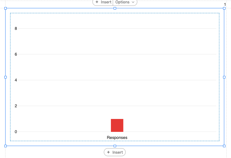
Here is an example of me trying to just show the percentile on a scale of 1-9. The bar represents the percentile in which this person's response fell. First off, I can't seem to make it so that gridlines appear for each Y-axis item. I also cannot seem to add a label to either axis (for example "Percentile" along the Y-axis). Finally, I cannot edit the bar label for this variable ("Responses"). I can alter the text that appears in the corresponding color in the legend; however, I don't want to show a legend. I want the label "Responses" to say something different.
These customizations really aren't that advanced. Is there another area in which I should be looking for more advanced reporting capabilities?
Thanks in advance for any advice you can provide.
!
Best answer by TohS
Hi @cprice,
Have you try to export the data to Excel and visualize it from there? I would suggest that's a better option given that you would like to edit the graph's visualization that you would like to have.
Thank you.

Sign up
Already have an account? Login

Welcome! To join the Qualtrics Experience Community, log in with your existing Qualtrics credentials below.
Confirm your username, share a bit about yourself, then you're ready to explore and connect .
Free trial account? No problem. Log in with your trial credentials to join.
No free trial account? No problem! Register here
Already a member? Hi and welcome back! We're glad you're here 🙂
You will see the Qualtrics login page briefly before being taken to the Experience Community.
Login with Qualtrics
Welcome! To join the Qualtrics Experience Community, log in with your existing Qualtrics credentials below.
Confirm your username, share a bit about yourself, then you're ready to explore and connect .
Free trial account? No problem. Log in with your trial credentials to join. No free trial account? No problem! Register here
Already a member? Hi and welcome back! We're glad you're here 🙂
You will see the Qualtrics login page briefly before being taken to the Experience Community.
Login to the Community
Welcome! To join the Qualtrics Experience Community, log in with your existing Qualtrics credentials below.
Confirm your username, share a bit about yourself, then you're ready to explore and connect .
Free trial account? No problem. Log in with your trial credentials to join.
No free trial account? No problem! Register here
Already a member? Hi and welcome back! We're glad you're here 🙂
You will see the Qualtrics login page briefly before being taken to the Experience Community.
Login with Qualtrics
Welcome! To join the Qualtrics Experience Community, log in with your existing Qualtrics credentials below.
Confirm your username, share a bit about yourself, then you're ready to explore and connect .
Free trial account? No problem. Log in with your trial credentials to join. No free trial account? No problem! Register here
Already a member? Hi and welcome back! We're glad you're here 🙂
You will see the Qualtrics login page briefly before being taken to the Experience Community.
Enter your E-mail address. We'll send you an e-mail with instructions to reset your password.