I have NPS data from 2015 - current loaded into Qualtrics. I'm trying to recreate a chart that shows the historical weekly NPS mean compared to the currently weekly mean.
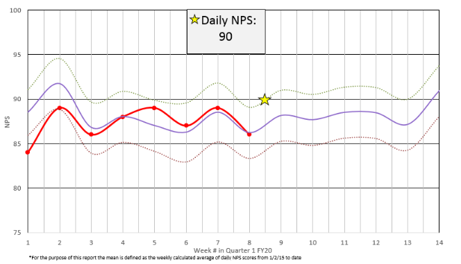
If that's unclear, let me phrase it a different way. I want to see 2 lines on my chart. The first line is simply the NPS for this week (red line in the attached image). The second line is the average of all of the NPS scores for this week in 2015-2018. (average of '15 weekly score + '16 weekly score + '17 weekly score + '18 weekly score) (purple line in the attached image). Both of these lines need to be in a line chart displaying a full quarter of data.
!
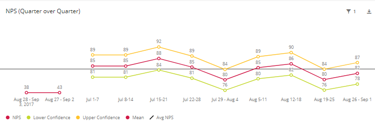
I've been toying with custom metrics all week, but the best I can seem to manage is adding points on the line as previous data, not compared to current data.
!
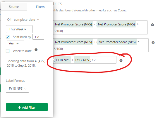
Here is the custom metric I'm toying with currently. I'm only trying to average out 2 years worth of data in this example. I'll expand it out further if I get this formula nailed down.
!
Thanks in advance for your help and ideas!