Hi,
I am working on creating various Qualtrics surveys for studies I am involved with at my university. For one of the questions, I would like to have a certain format on both desktop and mobile. My goal is to have a matrix table with 4 total options, the last column being a text entry.
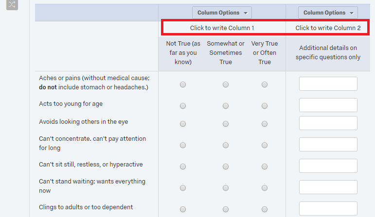
I want it to appear in this format on desktop, (this is just an example using side by side rather than a matrix table), although I do not want the header, as circled in red.
!
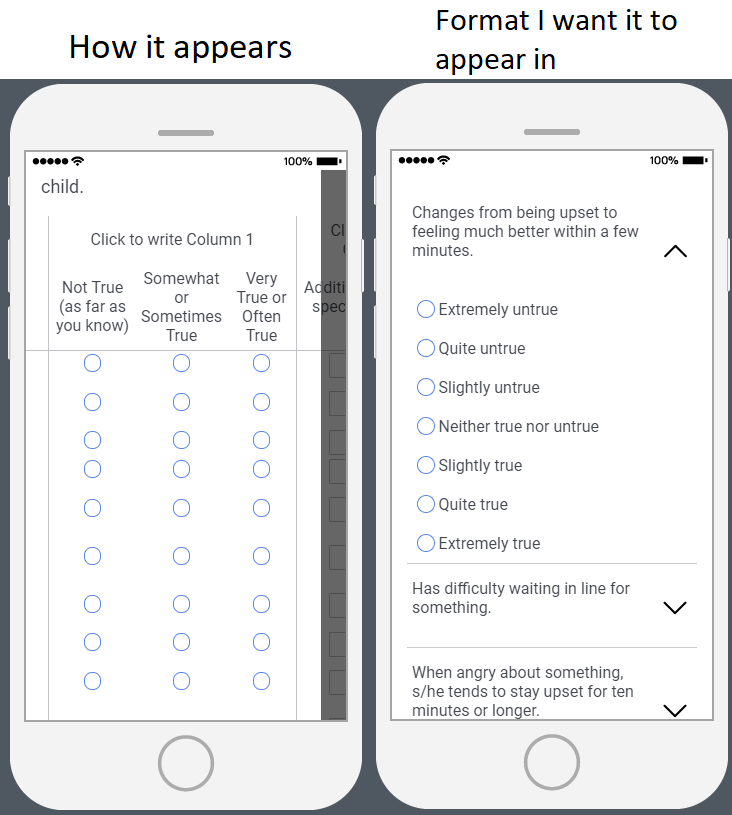
The problem with side by side mode is that on mobile, it appears as shown below on the left, and I want it appear as it does using the matrix table format (right), with each of the three choices listed followed by the text entry under the drop-down.
!
Is there a way to do this through the normal settings, or would it require JavaScript? Thank you in advance for any help!


