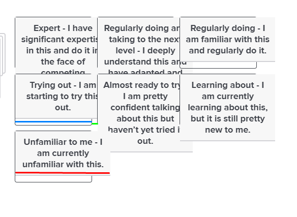
 I'm trying to figure out which attributes will affect the blue line (bucket width), red line (I'm calling it "bucket text width"), and the green line (space between buckets). I was also unsuccessful in changing the font attributes at all, so would love help there (especially in overriding the theme that we'll be using for this specific question, if that's possible). I'm specifically hoping to change font weight, type, and size. It'd be especially great if I could change part of the bucket text, but not all of it (so in the picture, if I could have "Expert" remain the font it is, but then everything after change). I'm unsure if that's possible in the format of the question type itself.
I'm certain this is fairly old hat for someone with the expertise, so if there is really good documentation somewhere I'll take that too, but so far I haven't had much luck adjusting the other help threads to fit my needs.
Thank you!
I'm trying to figure out which attributes will affect the blue line (bucket width), red line (I'm calling it "bucket text width"), and the green line (space between buckets). I was also unsuccessful in changing the font attributes at all, so would love help there (especially in overriding the theme that we'll be using for this specific question, if that's possible). I'm specifically hoping to change font weight, type, and size. It'd be especially great if I could change part of the bucket text, but not all of it (so in the picture, if I could have "Expert" remain the font it is, but then everything after change). I'm unsure if that's possible in the format of the question type itself.
I'm certain this is fairly old hat for someone with the expertise, so if there is really good documentation somewhere I'll take that too, but so far I haven't had much luck adjusting the other help threads to fit my needs.
Thank you!Formatting Pick, Group, and Rank questions
 I'm trying to figure out which attributes will affect the blue line (bucket width), red line (I'm calling it "bucket text width"), and the green line (space between buckets). I was also unsuccessful in changing the font attributes at all, so would love help there (especially in overriding the theme that we'll be using for this specific question, if that's possible). I'm specifically hoping to change font weight, type, and size. It'd be especially great if I could change part of the bucket text, but not all of it (so in the picture, if I could have "Expert" remain the font it is, but then everything after change). I'm unsure if that's possible in the format of the question type itself.
I'm certain this is fairly old hat for someone with the expertise, so if there is really good documentation somewhere I'll take that too, but so far I haven't had much luck adjusting the other help threads to fit my needs.
Thank you!
I'm trying to figure out which attributes will affect the blue line (bucket width), red line (I'm calling it "bucket text width"), and the green line (space between buckets). I was also unsuccessful in changing the font attributes at all, so would love help there (especially in overriding the theme that we'll be using for this specific question, if that's possible). I'm specifically hoping to change font weight, type, and size. It'd be especially great if I could change part of the bucket text, but not all of it (so in the picture, if I could have "Expert" remain the font it is, but then everything after change). I'm unsure if that's possible in the format of the question type itself.
I'm certain this is fairly old hat for someone with the expertise, so if there is really good documentation somewhere I'll take that too, but so far I haven't had much luck adjusting the other help threads to fit my needs.
Thank you!Best answer by Sona
Sign up
Already have an account? Login

Welcome! To join the Qualtrics Experience Community, log in with your existing Qualtrics credentials below.
Confirm your username, share a bit about yourself, Once your account has been approved by our admins then you're ready to explore and connect .
Free trial account? No problem. Log in with your trial credentials to join.
No free trial account? No problem! Register here
Already a member? Hi and welcome back! We're glad you're here 🙂
You will see the Qualtrics login page briefly before being taken to the Experience Community
Login with Qualtrics

Welcome! To join the Qualtrics Experience Community, log in with your existing Qualtrics credentials below.
Confirm your username, share a bit about yourself, Once your account has been approved by our admins then you're ready to explore and connect .
Free trial account? No problem. Log in with your trial credentials to join. No free trial account? No problem! Register here
Already a member? Hi and welcome back! We're glad you're here 🙂
You will see the Qualtrics login page briefly before being taken to the Experience Community
Login to the Community

Welcome! To join the Qualtrics Experience Community, log in with your existing Qualtrics credentials below.
Confirm your username, share a bit about yourself, Once your account has been approved by our admins then you're ready to explore and connect .
Free trial account? No problem. Log in with your trial credentials to join.
No free trial account? No problem! Register here
Already a member? Hi and welcome back! We're glad you're here 🙂
You will see the Qualtrics login page briefly before being taken to the Experience Community
Login with Qualtrics

Welcome! To join the Qualtrics Experience Community, log in with your existing Qualtrics credentials below.
Confirm your username, share a bit about yourself, Once your account has been approved by our admins then you're ready to explore and connect .
Free trial account? No problem. Log in with your trial credentials to join. No free trial account? No problem! Register here
Already a member? Hi and welcome back! We're glad you're here 🙂
You will see the Qualtrics login page briefly before being taken to the Experience Community
Enter your E-mail address. We'll send you an e-mail with instructions to reset your password.


